Micrsoft Excel Guidance
Contents
Structure
Naming worksheets
Index page
If you have several sheets in your workbook, it is helpful to provide an Index sheet at the beginning. This tells the user what the workbook is about and provides Contents which are hyperlinked to each sheet.
Learn how to create an index sheet
Cell A1
Cell A1 is an important cell and should never be left blank. The different ways you can use cell A1 are as follows:
- On the first sheet, cell A1 can be used to give a workbook summary (as in the previous section) to explain the purpose of the workbook and give important information about it.
- On any worksheet, cell A1 can be used for the title of the table that follows.
Cells, rows and columns
Cells, rows and columns in a worksheet should not usually be left blank. Blanks can cause confusion for screen reader users, as it is not clear whether the information is finished or not. They have few clues as to where to go next.
If a cell in a table does not contain any data, you can reduce confusion by indicating this in text. For example, you could insert a phrase such as 'no data'. An example is given below.
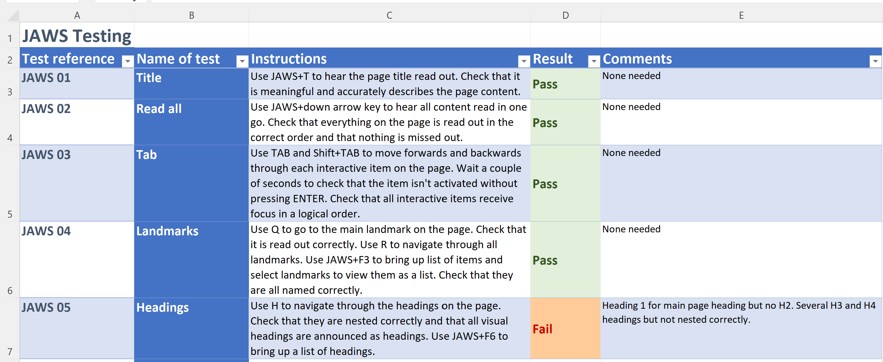
It is okay to have one blank row or column between different tables but no more than this. You should not have blank rows or columns within a table.
Tables
As with any application, it is important that tables are properly created with correctly marked up header rows/columns. In Excel, most data looks like a table. However, you can convert data into an accessible table, which is easier to navigate with a screen reader.
Learn how to create accessible tables
Colour and styles
Colour for information
Colour is often used in Excel spreadsheets to give information. For example, progress might be colour coded, green for ahead of schedule, orange for on schedule and red for behind schedule. This information cannot be perceived by someone who is blind, has low vision or is colourblind.
If you use colour to give information, the same information must also be given in text, to ensure that everyone can access it.
Examples of colour for information
Colour contrast
Colour contrast rules for Excel are the same as for any other application or website. There are videos showing how to check colour contrast in the sections on Word and PowerPoint. You should use the same technique to check colour contrast in Excel. Never use contrast that fails at AA level.
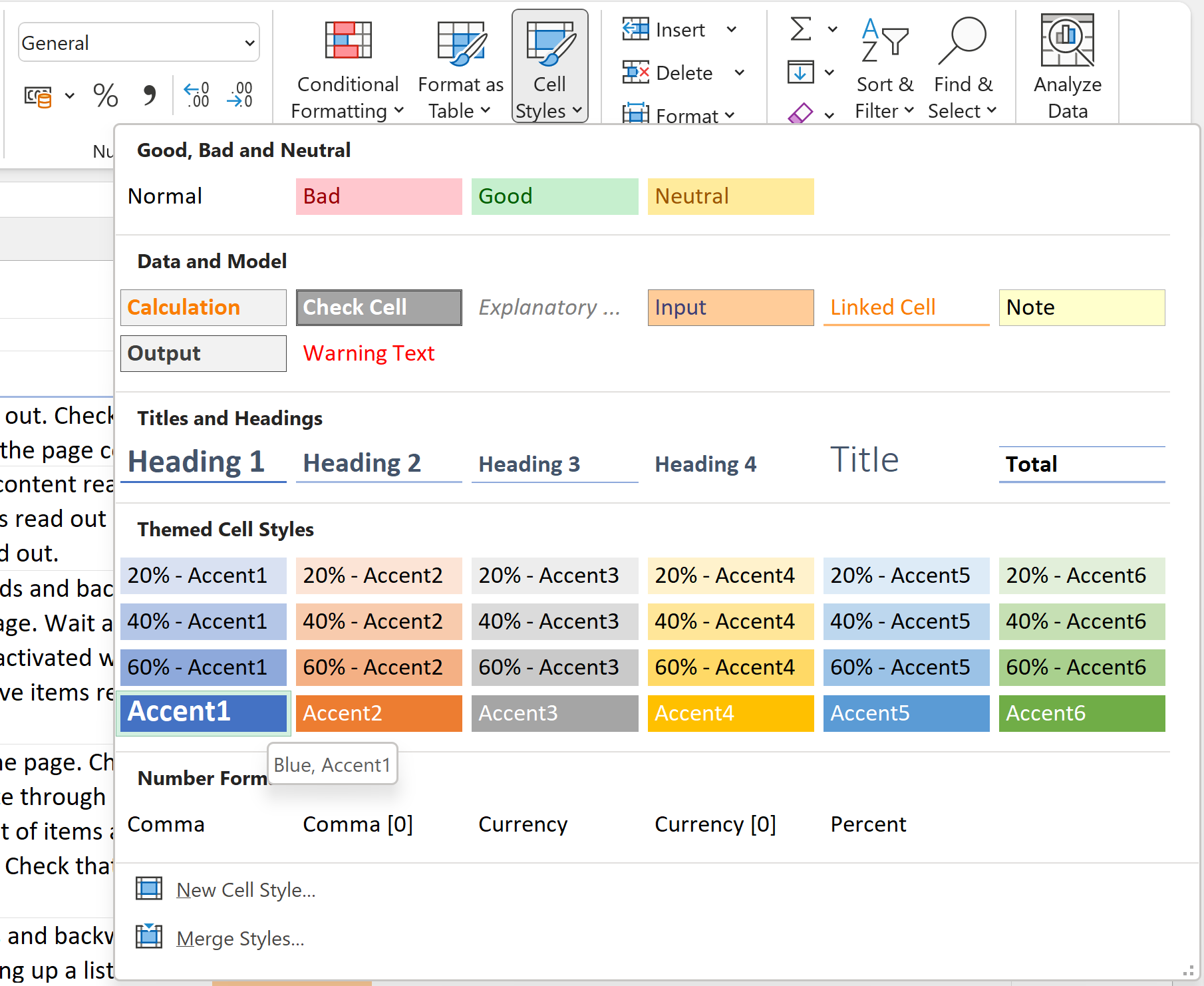
Cell styles
On the home ribbon in Excel, you will find cell styles. At first glance, these seem like the styles in Word, giving you the ability to assign headings of various levels. However, cell styles in Excel do not work with screen readers in the same way. They are purely for visual formatting.
Text and fonts
Readability
As with any essential content, the main thing is that the text should be easy to read. Choose fonts that are clear and uncluttered. It doesn't matter whether it is a serif or non-serif font, though many dyslexic people find non-serif fonts easier to read.
The minimum font size should be 11. The user can, of course, use the zoom function to make the whole page bigger, though sometimes that can reduce the amount of information on the page and make it more difficult to use. Try to aim for a font size that balances readability with the amount of information on the sheet. Lots of white space is not helpful.
Formatting for information
Whilst many screen readers are capable of announcing some text formatting, this is usually a specific setting and most users don't enable it. If you use text formatting, e.g. bold or capitalisation, to convey meaning, this is almost certain to be missed by some users. It is okay to use formatting but if it conveys meaning, provide that using text as well.
Format cells
Symbols and special characters
There are hundreds of symbols and special characters available to us on our computers. Only 17 of these read correctly with a screen reader. If a symbol is essential for meaning, you should communicate it in plain text as well.
Visual elements
Visual representations of data are great for helping some users to understand and interpret the data. However, not all users find them helpful and they are not immediately accessible to screen readers. This is because they sit in a floating layer, which is not automatically read out. They should always be supplemented with a full text description, which should be in a cell on the main worksheet, not in the alt text box.
Graphs and charts
Learn how to create accessible graphs and charts
Images
Images also sit in the floating layer and as such, they are not automatically detected by screen readers. It is therefore pointless giving them alt text in the usual way (an alt text box). Instead, put the alt text directly into a cell on the worksheet. That way, a screen reader user will be able to access it.
Of course, if your image is purely decorative, it does not require any alt text.
Floating objects
We have already covered graphs, charts and images, which sit in the floating layer. Other items which sit in this floating layer include: Word Art, Smart Art, shapes, text boxes and anything else which is not directly in a cell. You can usually identify floating objects by clicking on them. This will highlight a border box, with corner markers for resizing the box. Anything that is in the floating layer which is essential for meaning, should be given a full text description in a cell.