Reflow
There are many reasons why this criterion is important. Visually impaired people will often need to view content in one column and enlarge it. It is also important so that mobile device users get a good experience. The criterion states:
Content can be presented without loss of information or functionality, and without requiring scrolling in two dimensions for:Except for parts of the content which require two-dimensional layout for usage or meaning.
- Vertical scrolling content at a width equivalent to 320 CSS pixels;
- Horizontal scrolling content at a height equivalent to 256 CSS pixels.
Reflow needs to kick in when the browser window gets below a certain size or when the text zoom goes above a certain size. So, for example, if you view this page on a tablet or a mobile phone, it will fill the whole width of the screen and the text will still be big enough to read. If you view it on a laptop or desktop, but zoom in with the browser to 150%, and then 250%, then a similar change will occur. This is because I have three style sheets, one for large screens, one for tablets and one for mobile screens.
How to achieve reflow
Using responsive web design will enable reflow. It means having at least two different CSS style sheets and linking to them using a media query, to determine the size of the screen. This is done in the <head> section of your HTML. The code will be something like this:
<link rel="stylesheet" media="(max-width: 600px)" href="../mobile.css">
<link rel="stylesheet" media="(min-width: 601px) and (max-width: 991px)" href="../tablet.css">
<link rel="stylesheet" media="(min-width: 992px)" href="../large.css">
Then, in the CSS, for each element, you will need to decide whether and how it needs to be changed. Here are some examples from mine, but this is not a definitive list.
Using CSS Grid
CSS Grid is great for styling the main layout of the page. I've used it to make sure the regions of each page display and reflow correctly.
I have only recently learned how to use the Grid CSS to layout my page, and I have applied the change retrospectively. This is a good example of how it is easier and more efficient to get something right at the beginning, rather than fixing it later. If I had the time to redesign my whole site before making the changes live, I would have done this differently, but I run my website as a spare time project, and only have time to do small changes at a time.
Large screen CSS
Let's launch into the first part of the code:
.container {
  display: grid;
  grid-template-columns: repeat(12, [col-start] 1fr);
}
This sets up my container as a grid with 12 equally sized columns. I chose 12 because it divides by a lot of numbers. You can divide 12 equally by 6, 4, 3 and 2, so it is very flexible.
Next, I created a <div class="header"> and then a similar one for each of the other landmarks, in my HTML. In the CSS that follows, the col-start is the column (out of 12) that I want that landmark to begin in. The span is the number of columns it takes up.
.header {
	grid-column: col-start 3 / span 8;
}

.nav {
	grid-column: col-start 3 / span 8;
}

.main {
	grid-column: col-start 3 / span 8;
}

.footer {
	grid-column: col-start 3 / span 8;
}
As these are all the same, you would expect everything to line up vertically... and it does.
Tablet CSS
For tablets, which are between large and small screens, I want the overall width to be a little wider but to keep everything else the same. So I want each landmark to start in column 2 and take up 10 columns.
.header {
	grid-column: col-start 2 / span 10;
}

.nav {
	grid-column: col-start 2 / span 10;
}

.main {
	grid-column: col-start 2 / span 10;
}

.footer {
	grid-column: col-start 2 / span 10;
}
Mobile CSS
For mobile screens, which are generally pretty small, I don't want to waste any space. So I want the landmarks to take up the whole width of the screen.
.header {
	grid-column: col-start 1 / span 12;
}

.nav {
	grid-column: col-start 1 / span 12;
}

.main {
	grid-column: col-start 1 / span 12;
}

.footer {
	grid-column: col-start 1 / span 12;
}
Using CSS Flexbox
For me, the next thing I wanted to display differently was the navigation menu. I was happy for that to look the same on large and tablet screens but I wanted it to display vertically for mobile screens.
Let's compare the CSS for large and mobile. To keep this simple, I will only show those parts that differ.
Large screen navigation menu
For large and tablet screens, I want my navigation menu to display as items in a row. I want them to wrap onto the next row, if the screen isn't big enough for them all to fit.
The justify-content: flex-start; aligns the items to the beginning of the container.
.navbar {
	display: inline-flex;
	flex-direction: row;
	flex-wrap: wrap;
	justify-content: flex-start;
Mobile screen navigation menu
For mobile screens, I want my navigation menu to display as items in a column. I want them to display vertically.
The justify-content: center; aligns the items to the centre of the container.
.navbar {
	display: inline-flex;
	flex-direction: column;
	flex-wrap: wrap;
	justify-content: centre;
Tables
Tables can be problematic when displayed on a small screen, especially if there are many columns or a lot of text in each column. Often, a well-coded table will just shrink to match the screen size, but sometimes, columns can be lost or require horizontal scrolling.
Let's have a look at an example table:
| Day | Early morning | Late morning | Early afternoon | Late afternoon |
|---|---|---|---|---|
| Monday | Start of the week team meeting | Team one-to-ones | Task work | Line management admin |
| Tuesday | Task work | Testing | Senior leadership meeting | Project admin |
| Wednesday | Task work | Testing | External visits | External visits |
| Thursday | Task work | Testing | Report writing | Project admin |
| Friday | Team wellbeing session | Finishing off tasks | End of week team meeting | Clean office |
Now let's see what that table looks like on different sized screens. First, here is a screenshot of how it looks on a large screen.
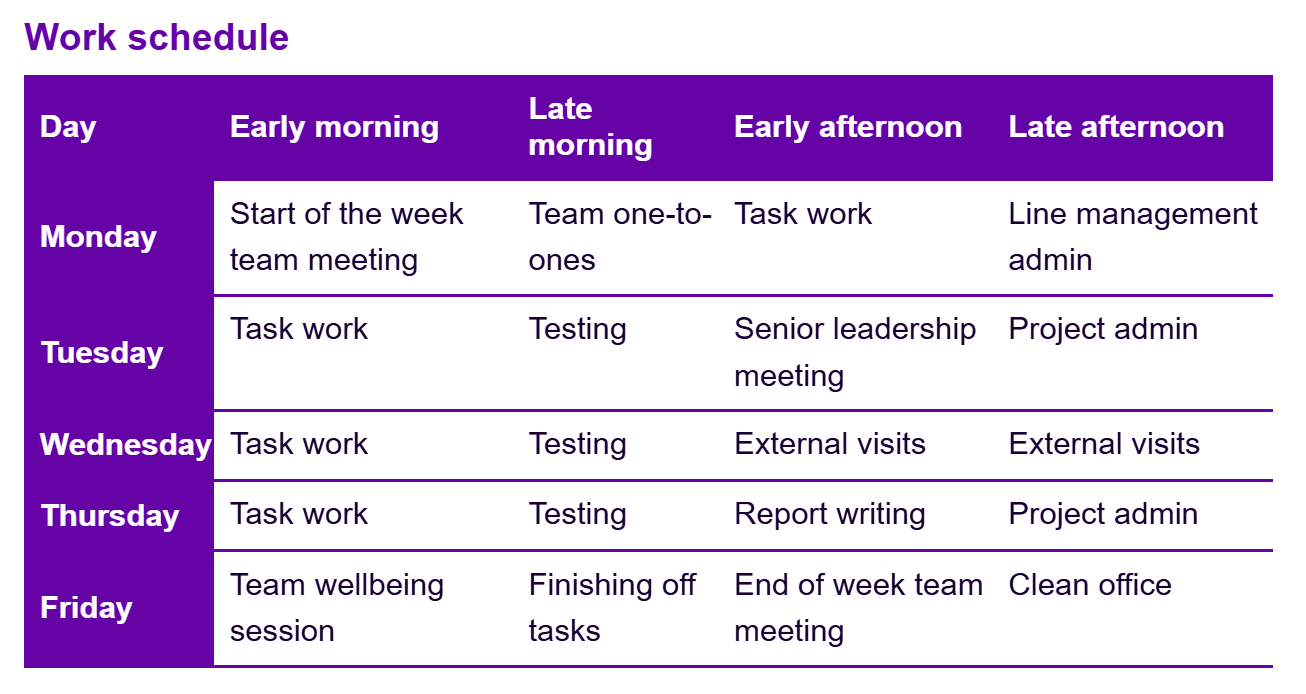
So far, so good. All the information fits nicely on the screen and there isn't a problem. Now let's see how it looks on a mobile screen. The same would happen though if you used a large screen but zoomed in to 250% or more.
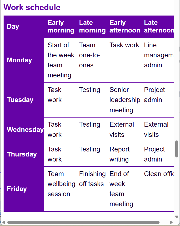
This time, text in the final column begins to fall off the screen and you have to scroll horizontally to get it back. This isn't a good experience.
Changing the table display
Let's take that same table and make it display in a different way on a mobile device.
| Day | Early morning | Late morning | Early afternoon | Late afternoon |
|---|---|---|---|---|
| Monday | Start of the week team meeting | Team one-to-ones | Task work | Line management admin |
| Tuesday | Task work | Testing | Senior leadership meeting | Project admin |
| Wednesday | Task work | Testing | External visits | External visits |
| Thursday | Task work | Testing | Report writing | Project admin |
| Friday | Team wellbeing session | Finishing off tasks | End of week team meeting | Clean office |
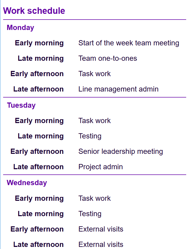
The table looks exactly the same on a large screen but this time, it changes its layout on a smaller screen. Here is how that table displays on a mobile screen.
HTML code
So how do we do that? Let's have a look at the code. I'll just give you the header row and the first two rows of data.
	<table>
	<caption>Work schedule</caption>
	<tr>
		<th scope="col" class="mobile">Day</th>
		<th scope="col" class="mobile">Early morning</th>
		<th scope="col" class="mobile">Late morning</th>
		<th scope="col" class="mobile">Early afternoon</th>
		<th scope="col" class="mobile">Late afternoon</th>
	</tr>
	<tr>
		<th scope="row" class="mobile">Monday</th>
		<td data-cell="Early morning" class="mobile">Start of the week team meeting</td>
		<td data-cell="Late morning" class="mobile">Team one-to-ones</td>
		<td data-cell="Early afternoon" class="mobile">Task work</td>
		<td data-cell="Late afternoon" class="mobile">Line management admin</td>
	</tr>
	<tr>
		<th scope="row" class="mobile">Tuesday</th>
		<td data-cell="Early morning" class="mobile">Task work</td>
		<td data-cell="Late morning" class="mobile">Testing</td>
		<td data-cell="Early afternoon" class="mobile">Senior leadership meeting</td>
		<td data-cell="Late afternoon" class="mobile">Project admin</td>
	</tr>
</table>
CSS code
th.mobile[scope="row"] {
	display: block;
	padding-top: 0.5rem;
	padding-bottom: 0.5rem;
	padding-left: 0.5rem;
	text-align: left;
	background-color: #ffffff;
	color: #6503A6;
}

th.mobile[scope="col"] {
    display: none;
}

td.mobile {
	display: grid;
	grid-template-columns: 40% 60%;
	padding-top: 0.3rem;
	padding-bottom: 0.3rem;
	padding-left: 0.5rem;
	color: #1A0133;
	text-align: left;
	line-height: 1.5rem;
}

td.mobile::before {
    content: attr(data-cell);
    font-weight: bold;
    text-align: right;
    padding-right: 2rem;
}
Other elements
There may be other elements that you want to display differently, depending on the screen size. You can style any element so that it works best on a given screen size. Just change the CSS in the relevant file.
How to test reflow
The easiest way to test whether your webpage reflows is to just make the window smaller and see what happens. However, there are also some useful tools that can give a more specific picture.
Web developer extension 
I use this extension a lot. It has loads of handy tools to help check various accessibility issues. In this case, I've selected the Resize tab.

If you then select View responsive layouts, a new window opens with various different mobile views. You can scroll down and interact with each one to ensure that everything is behaving correctly. Here's an example from my mountaineering up Snowdon blog post.
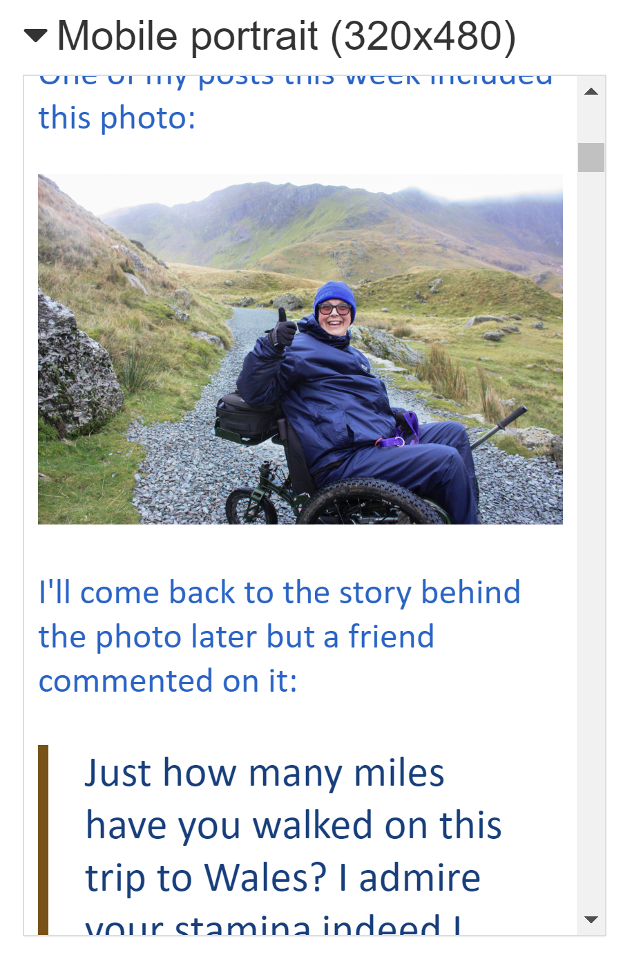
I can now check that it is only scrolling vertically (unless exempt content applies) and that everything is showing correctly on the page.