Images of text
The success criteria states:
If the technologies being used can achieve the visual presentation, text is used to convey information rather than images of text except for the following:
- Customisable
- The image of text can be visually customized to the user's requirements
- Essential
- A particular presentation of text is essential to the information being conveyed.
There is a lot about text that we take for granted. It is readable. It's visual presentation can be changed to suit the reader. It can be zoomed into without losing clarity. Many of these features are lost when we use an image of text.
What is an image of text?
The most common way I see nowadays of making an image of text, is when people take a screenshot. This is like taking a photograph of text. Sometimes, there is a really good reason for using a screenshot. It can preserve the exact appearance of the original and it may include images that help to tell the whole story. However, often a screenshot is used because it is easier than taking the text and formatting it.
Here is an example:
Global Accessibility Awareness Day
There will be 6 bitesize sessions throughout the day, focussing on different elements of digital accessibility.
- Colour contrast
- How to check and amend contrast
- Alt text
- How to add alt text to images
- Hyperlinks
- How to write meaningful link text
- Inputs and labels
- How to avoid orphaned inputs
- Buttons v links
- When to use buttons and links
- Language
- How to mark the language of the page and parts
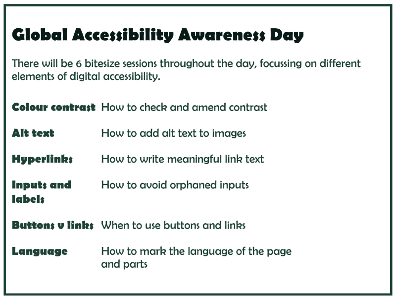
Now here is the same advertisement but as a screenshot:

Why does it matter?
If you are reading this on a computer with a decent sized screen, you will probably think they look identical. However, try minimising the window or checking what it looks like on a mobile phone. The text version adjusts as the screen size changes, whereas the image doesn't.
If you wanted to copy and paste some of the information, in the first advert, you can select text, copy it and paste it. In the second advert, you can't because it isn't text. It can't be accessed in the same way.
Also, if you are accessing this with a screen reader, you may have noticed my very lazy alt text for the image. If you do use an image for something like this, you must make all of the information available for people using a screen reader. Alt text cannot be interacted with, which is why it should be brief. This kind of information would require a long description, so it would just be easier to use text in the first place!
When can I use images of text?
There are some situations where images of text are appropriate and acceptable:
- Logos - a logo usually incorporates some kind of imagery with text, so this is fine
- To preserve the exact appearance - examples might include historical documents, certificates, photo of a manuscript
- To show fonts - an example might be when showing the difference between serif and sans serif fonts. You wouldn't want the user to override the font shown, as it would invalidate the purpose.
