Published: Sunday 6 April 2025
Hemingway readability: Grade 5, good. 1,184 words.
Making documents adaptable
I often receive emails with this line in the signature, I make my emails accessible by using Arial font size 12.
This shows very poor understanding of accessibility. They are right, it is good practice to use a clear, sans-serif font. It is also right to choose a font size that most people can read. These do not make a document accessible though.
Wherever possible, your document will be more accessible if you allow users to adapt it. What makes writing for neurodiversity quite difficult, is that everybody is different. What enables one person to access content might make it more difficult for another. The first key is to allow users to change the way content looks.
What should I do?
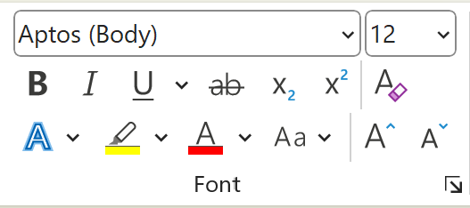
This one is more about what you should not do. Do not restrict editing in documents, unless it is critical to preserve the purpose of it. Allow users to change the font, the font size and the colours used.
Users might also want to change the line spacing to make text easier to read. Users can do this, as long as you don't restrict editing or lock the document.
Who does this help?
Allowing users to adapt the way a document looks can help the following people:
- People with low vision
- People with dyslexia
- People with cognitive impairments.
How does it help?
Fonts
Most people have very little difficulty reading standard fonts. However, some people find that the font makes a big difference. Some fonts are created to help people with dyslexia. Some fonts are better for people who need each letter to look distinct. Let's have a look at some examples:
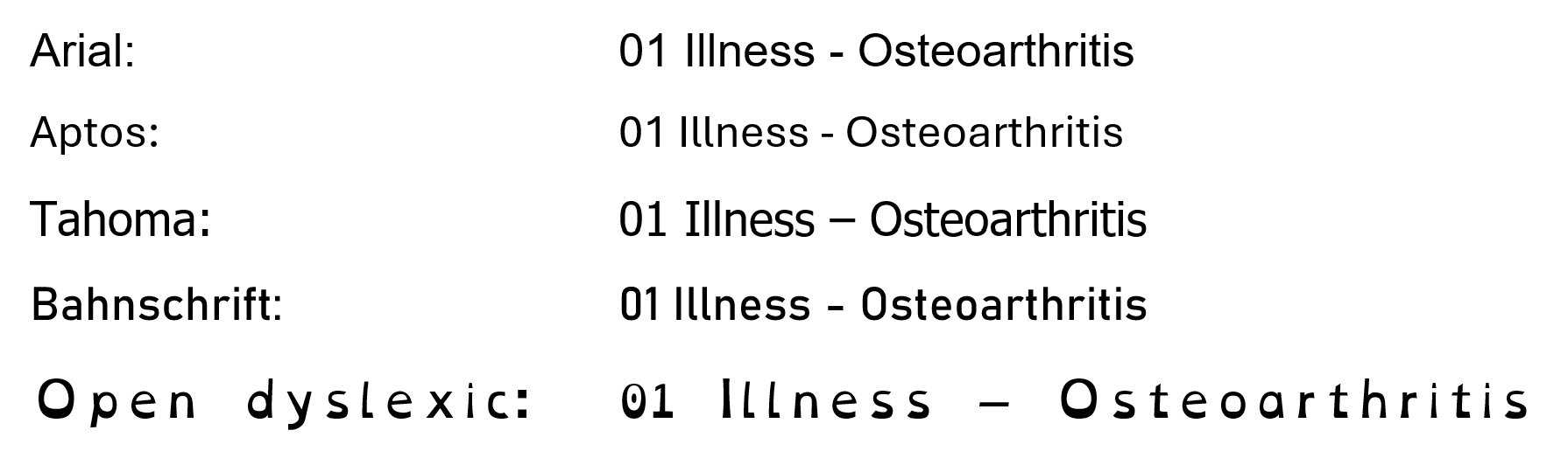
For now, don't worry too much about the actual fonts used. Let's focus on two sets of characters. First, look at the number 1, the capital I and the lower case l. In all these examples, the number 1 has an instroke at the top and two of them have a baseline (Tahoma and Open Dyslexic). This makes the number easy to tell apart from letters with a similar shape. There are fonts though, that just use a single vertical line for number 1.
Now look at the I and the l. With Arial, they are very hard to tell apart. Aptos, Bahnschrift and Open Dyslexic have a little flick or tail on the l. Tahoma has a top and base on the I.
Similarly, if we look at the number 0 and the capital O, they can look quite similar. In general, the number 0 is narrower but Open Dyslexic makes them look different by putting a dot in the number.
Line spacing
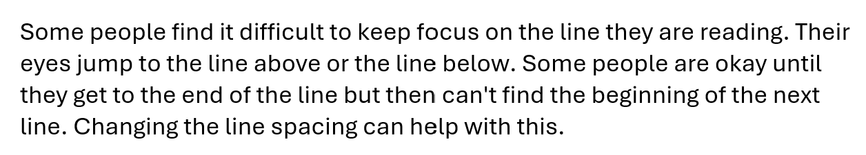
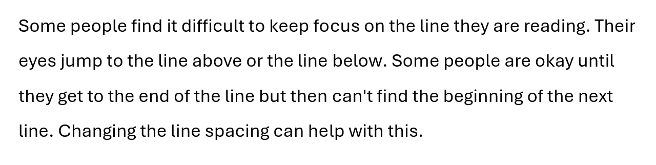
Some people find it difficult to keep focus on the line they are reading. Their eyes jump to the line above or the line below. Some people are okay until they get to the end of the line but then can't find the beginning of the next line. Changing the line spacing can help with this. Keeping the text aligned to the left can also help.
Let's look at some examples:
In the first example, the text has single line spacing and it is justified. Justified text is where the text has a straight edge on both the left and right sides of the paragraph. This is done by adjusting the spacing between words. It can result in some big spaces in the middle. These can make it more difficult to read.
In the second example, the text is left-aligned but still has single line spacing. The lines are very close together and this can make it difficult to keep focus on the correct line of text.
In the last example, the text is left-aligned and has 1.5 line spacing. For many people, this makes it easier to read. For some, it can make the difference between being able to read the text and not being able to read it at all.
What standards does this relate to?
- COGA objective 8 Support adaptation and personalisation

- WCAG 1.4.4 Resize text
- WCAG 1.4.8 Visual presentation
- WCAG 1.4.12 Text spacing
COGA 8 Support adaptation and personalisation
This objective has 4 parts. The last part is to support a personalised and familiar interface.
Allowing user preferences on presentation such as font style, font size, line heights, margins, and contrast. (Note: The default version should still be readable and use clear fonts.)
When reading documents (Word, Excel, PowerPoint, emails), you can allow users to personalise it by not restricting editing. The user should be able to change the theme, colours and fonts to make it easier for them to read the document.
WCAG 1.4.4 Resize text
This level AA success criterion says:
Except for captions and images of text, text can be resized without assistive technology up to 200 percent without loss of content or functionality.
The important thing here, is without assistive technology
. The user should be able to resize the document or any part of it. This should not need assistive technology. Again, this means not restricting editing. The user might want to increase the font size, but not the whole document.
WCAG 1.4.8 Visual Presentation
This level AAA success criterion says:
For the visual presentation of blocks of text, a mechanism is available to achieve the following:
- Foreground and background colors can be selected by the user
- Width is no more than 80 characters
- Text is not justified
- Line spacing (leading) is at least space-and-a-half within paragraphs, and paragraph spacing is at least 1.5 times larger than the line spacing
- Text can be resized without assistive technology up to 200 percent in a way that does not require the user to scroll horizontally to read a line of text on a full-screen window.
For all these things, you don't need to do them for the user. The user must be able to change these things for themselves. As this series is only about documents (not web), you can achieve this by allowing users to make changes to your document. Do not restrict editing.
WCAG 1.4.12 Text Spacing
This level AA success criterion says:
In content implemented using markup languages that support the following text style properties, no loss of content or functionality occurs by setting all of the following and by changing no other style property:
- Line height (line spacing) to at least 1.5 times the font size
- Spacing following paragraphs to at least 2 times the font size
- Letter spacing (tracking) to at least 0.12 times the font size
- Word spacing to at least 0.16 times the font size.
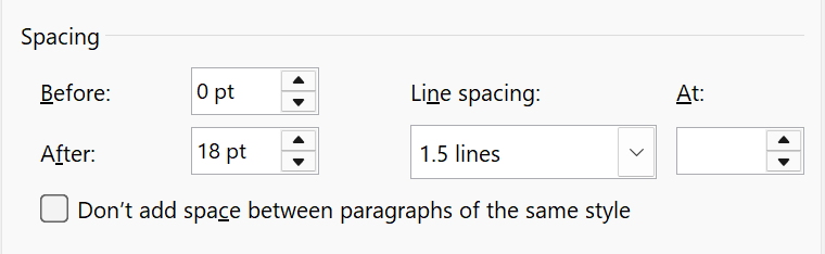
The same is true here. You don't have to use these settings. You have to allow the user to change to these settings. In general though, I usually use 1.5 line spacing and 18 pt of spacing after each paragraph. I find that easy to read and I think many other people do too.
The most important thing
Let the user change fonts, sizing, colours, spacing and other visual things. This makes it more readable for each person.