Published: 21 July 2024
Excel Accessibility

I tend to get two assumptions about Excel. The first is that it is automatically accessible because all you do is put data in cells, so what's to go wrong? The second is that Excel is not at all accessible and that we should either avoid it or not even worry about accessibility.
Neither is true. Excel, like most other applications, can be used to create accessible content but you have to know what you're doing. In this day and age, I really think we should all know how to do this, which is why I write these blogs and run my website.
Navigation
Unlike Word, where you start at the top and read down, Excel has to be navigated. Let's think about this for a moment. You have to navigate around the cells in a worksheet. If there are several worksheets in a workbook, you have to navigate between them. For those that have good eyesight and use a mouse, that's fairly simple, but how do we make it easier for those that can't see well and those that can't use a mouse?
What do I need to do?
To make your Excel spreadsheet accessible to navigate, you need to do three things:
- Give your worksheets meaningful names
- Provide an Index sheet
- Use cell A1 to give information about each worksheet.
Why does that matter?
Understanding what is in a workbook and being able to get from worksheet to worksheet is important. One of the biggest challenges in Excel, is that it is very visual. Have you ever thought about how a blind person would navigate it? A screen reader will read out information but as the content creator, you have to set up that information first.
How do I do that?
For this part, I'm going to give instructions about what you need to do, and then some additional help for people who don't use a mouse.
- Rename each worksheet, giving them unique names that are meaningful and describe what the user will find there.
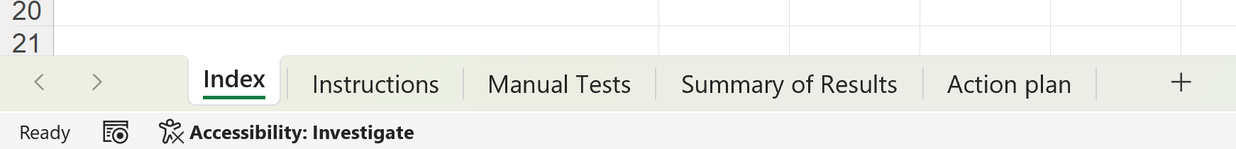
- Make the first worksheet an Index page. Use cell A1 of this sheet to explain what the whole workbook is about. Provide links to each of the other worksheets.
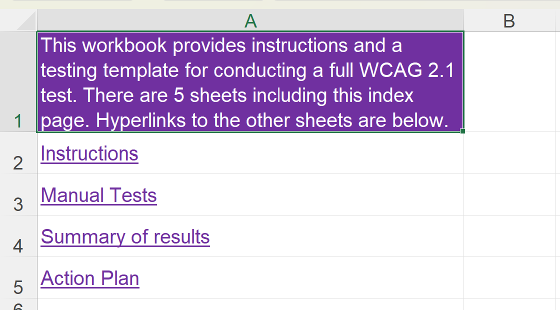
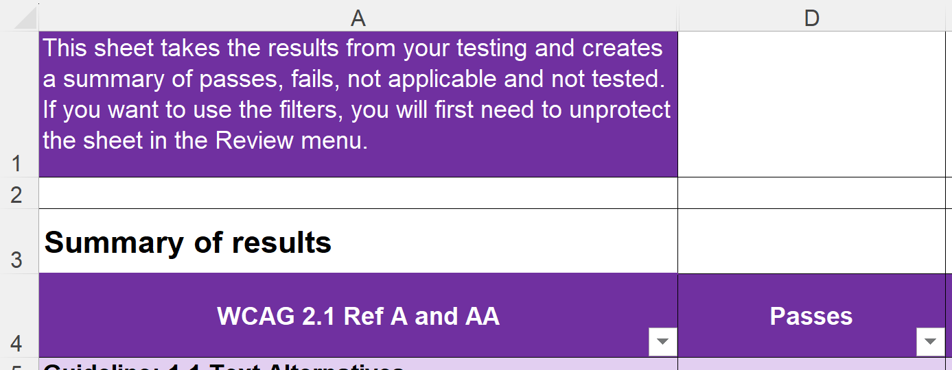
- Use cell A1 on each worksheet to explain what that sheet is about and what it contains. You can also give tips for navigation and inform the user about the location of tables and graphs.
- Wrap the text in any cell and change the column width to make it easier to read. Don't allow text to spill into the next cell and don't merge cells.
Navigation instructions for keyboard navigators
Here are some keyboard commands for moving around your Excel workbook.
- Rename worksheet
- Press Alt, H, O, R and then type your new name.
- Add a new worksheet
- Press Alt, H, I, S and then rename your new sheet.
- Move a worksheet
- Press Alt, H, O, M and then use the arrow keys to choose where you want to move it to. Press Tab and then Enter.
- Create an internal link
- Press Alt, N, I, 2, I to open the Hyperlink dialogue box. Press Ctrl + Tab 4 times to select Place in this document. Press Tab and then use the arrow keys to select the sheet you want to link to. Press Tab to move to Text to display and edit this to make it meaningful. Tab to the OK button and press Enter.
- Wrap text in a cell
- Press Alt, H, O, E and then use the left and right arrow keys to change tabs. Text wrapping is in the Alignment tab. Press Tab to move through the options, until you get to Wrap Text and press Space to select it.
- Change column width
- Press Alt, H, O, W to open the Column Width dialogue box. Type in a new value and press Enter.
Navigation instructions for screen reader users
Screen reader users should use the keyboard commands above. You may prefer to press Alt to get into the menus and then use your arrow keys to select, as this will make your screen reader read out each menu name, so you don't have to memorise the shortcuts.
Navigation instructions for voice recognition users
Voice recognition users can use two different types of command:
- For menus and anything that has a label on the screen, you should be able to say, "Click..." followed by the label.
- You can use keyboard commands (above) by saying, "Press..." followed by the key you want.
Tables
Excel is formatted in rows and columns, with data in cells. So that makes it a table, right? Wrong! Putting the data in the cells makes it look like a table but a screen reader doesn't read it as a table.
What do I need to do?
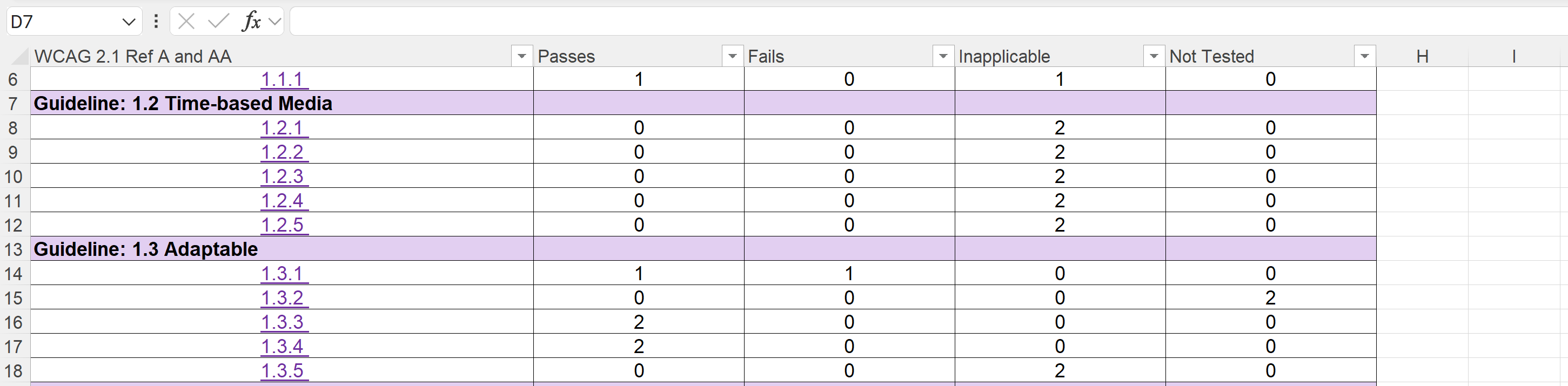
When you've input your data and you've got your headers in place, you need to turn it into a semantic table. You need to:
- Convert the data into a table
- Ensure that the headers are marked as headers
- Give the table a name.
You should generally have only one table on a worksheet and avoid splitting or merging cells. A simple table is more accessible for most people.
Why does that matter?
The nature of a table is that it is visual. When a blind person accesses a table, they need to be able to understand the data in a non-visual way. They generally navigate by moving around the cells and the screen reader will announce changes in header information, as well as the data in the cell.
There is another advantage of creating a proper table, which benefits everyone. When you scroll down the table and the headers go off the screen, the column letters will be replaced by the header information. This makes it much easier to navigate for everyone.
How do I do that?
Table instructions for mouse users
- Select the cells that will form the table, including any headers.
- Click on the Insert menu.
- Select Table from the ribbon.
- Check that the identified range of cells is correct.
- Check the box that says My table has headers.
- Click OK.
- In the Table Design menu, click in the Table Name field and give your table a one-word name.
Table instructions for keyboard navigators
- To select the cells in your table, hold down Shift and use the arrow keys until all cells are selected.
- Press Alt followed by N to open the Insert menu.
- Press T to open the Create Table dialogue box.
- Press Tab followed by Space to check the box for My table has headers.
- Press Tab to move to OK and then Enter to close the dialogue box.
- Press Alt, J, T, A to move to the Table Name field.
- Give your table a one-word name.
Table instructions for screen reader users
- Select the data for your table by pressing Shift + the arrow keys until all data is selected.
- Press Alt, N, T to open the Create Table dialogue box.
- Check that the My table has headers checkbox is checked.
- Press Tab to get to the OK button and then Enter.
- Press Alt, J, T, A to go to the Table Design menu and enter the Table Name field.
- Type in a name for the table and press Enter.
Table instructions for voice recognition users
- Select the data for your table. You should be able to say, "Select cell A3 through C8," or similar but if that doesn't work, you could try, "Press Shift down x times," and "Press shift right x times."
- Say, "Click insert, click table," to open the Create Table dialogue box.
- Check that the My table has headers checkbox is checked.
- Say, "Click OK," to close it and create your table. You will now be in the Table Design menu.
- Say, "Click Table Name," to move into the Table Name field.
- Dictate your table name. If your voice recognition software automatically inserts a space after a word, you will need to delete the space. You could say, "Press backspace."
- Say, "Press Enter," to leave the field and return to your spreadsheet.
Charts and Graphs
Charts and graphs are helpful for many people in understanding data, seeing patterns and being able to identify trends. However, they are highly visual and need some work to ensure that everyone can access them.
What do I need to do?
When you create a chart or graph, you need to:
- Give it alt text, in a cell behind the graph
- Include the raw data in a table
- Use meaningful titles and labels
- Make sure that being able to see colour is not the only way of interpreting the information
- Check the colour contrast meets the minimum ratio of 3:1.
Why does that matter?
Much of our accessibility work so far, has focussed on blind people and screen readers. For charts and graphs though, most blind people will work with the raw data, which is why it's important to include it.
You do need to give your graph alt text, but it is pretty pointless adding it in the alt text box like you normally would. Graphs don't sit in a cell. They hover above the worksheet in a floating layer, which screen readers don't read unless the user deliberately navigates there. So you should put the alt text in a cell, which will be automatically read out. It's best to put it in a cell behind the graph. That way, sighted users won't see it and blind people will receive it.
Most of the accessibility work with graphs is to help sighted people. Think about people with low vision, who use screen magnification and colour enhancements. Also think about people who cannot see colour accurately or even at all. How will they perceive the graph or chart? You need to provide meaningful text labels to help orient users and ensure that any visual information does not need accurate colour perception to understand it.
How do I do that?
For this section, I'm going to break with the previous format and we'll look at the different things you need to do and how you can get to them using mouse or keyboard. For screen reader users and voice recognition users, you can use the keyboard method as well as any normal commands you use.
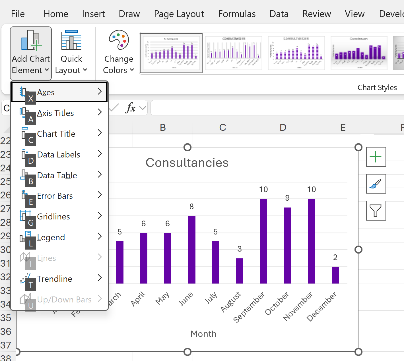
Chart Elements
In the Chart Elements options, you can select which elements you want your chart or graph to have.
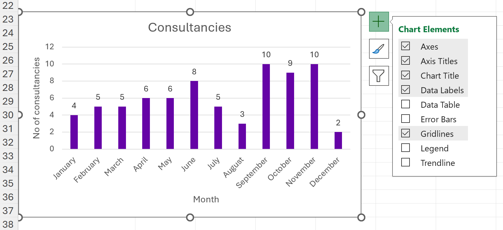
Mouse users can click on the plus icon next to the chart to access the Chart Elements. For keyboard access, go to the Chart Design menu and Add Chart Element. This is Alt, J C, A, and then select the letter of the element you want to select or deselect.
You should select the following chart elements:
- Axes - this enables the reader to identify what information they are consuming. It helps to orient all users, but is particularly useful for people who find it difficult to process complex information.
- Axis titles - these should be meaningful and help the user to understand what the numbers, scale or other information is about.
- Chart title - this should be brief but meaningful and should tell the user what the whole graph is about.
- Data labels - these are very useful for people who use screen magnification and cannot see the whole graph on the screen at one time. It means they don't have to move back and forth horizontally to read the data. It adds the number on the graph for each data point.
- Gridlines - these can make it easier for people to visually scan across the graph.
Style and Colour
You should select a style that is clear and easy to read.
There are two really important things to consider regarding colour. The first is that you should not use colour as the only means of giving information. This means you should not use a legend or key, with different coloured graph elements. Imagine printing your graph on a black and white printer. Would you still be able to make sense of it? If not, you need to rethink your use of colour.
The second thing to consider is colour contrast. The minimum colour contrast between the graph and the background is 3:1. The contrast between colours that touch each other should also be minimum 3:1. You can check the colour contrast using the WebAIM contrast checker ![]() .
.
Mouse users can change the styles and colours by clicking on the paintbrush icon next to the graph, the second of the three icons. Keyboard users will need to go to the Chart Design menu and Change Colours.
Summary
We have covered an awful lot of information in this post. Excel is not automatically accessible but, with a little work, it can be made accessible. You need to:
- Give users navigational information such as worksheet names, information about each sheet (in cell A1) and an index sheet with links to the other sheets in the workbook
- Convert tables of data into semantic tables, so that screen reader users can navigate and understand the data easily.
- Make visualisations clear and easy to see and understand, and provide alt text so that blind people know what is there.