Published: 27 January 2023
I can't see very well
This is a huge topic! There are so many reasons why a person might not be able to see very well. What does it mean when somebody says this anyway? It can range from a person who has been temporarily dazzled by the sun and can't focus clearly at this moment, to someone who has a significant sight impairment and finds it difficult to see most things.
Like many things, sight loss is a vast spectrum. There are different causes of low vision but also different ways that people experience it. Some people have reduced vision in general. Others might lose their peripheral vision or experience blind spots. Colour is a whole area to consider. I could probably have written an entire post about colour.
It would be impossible to cover everything in this post, so I'm going to focus on some tools that users with low vision might find useful. Then I'll give some tips that content creators could follow to make it easier for users with low vision to access their content.
I don't normally use a table of contents on my blog posts, but this one has turned out to be a long one and you probably only need to read about the assistive software for your device.
Contents
In a document
Let's assume that someone has sent you an email, a document, a spreadsheet or some slides. Normally, you can read them but they have used a smaller font size or a font that is more difficult to read. You don't need everything on your device to be bigger but you need this particular document to be bigger. This is a very easy problem to fix.
In the bottom right corner of the screen, there is usually a zoom bar. In theory, you can use the mouse to drag that to the right and increase the zoom level within the document. I say, "In theory..." The problem, as I see it, is that the zoom bar is quite small to see, so it might be difficult to actually achieve.
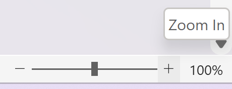
It might be easier to go to the View menu and change the zoom settings in there. The following video shows how to do that without using the mouse at all.
This also works in Excel, PowerPoint and Outlook. Most applications have some kind of view menu, where you can increase the size of the text.
Assistive software
Windows Built-in Tools
Windows 10 - Ease of Access
To open the Ease of Access centre, go to Settings and then select Ease of Access. You can also start typing Ease of Access in the Search bar, next to Start.
Display
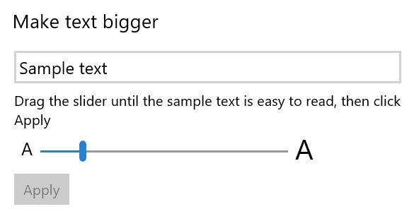
In the Display section, you can make just the text bigger or you can make everything bigger. To make text bigger, slide the bar to the right until the sample text is easy enough to read.
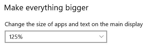
To make everything bigger, select a percentage from the dropdown menu. They start at 100% and go up in multiples of 25% to 175%.
Mouse pointer
The mouse pointer is often difficult to see on the page. It becomes even more difficult for anyone watching a screenshare. I always make mine bigger because I screenshare a lot to show people how to do things.
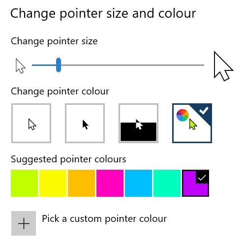
You can increase the size of the mouse pointer by moving the slider bar to the right. You can change the colour of it by selecting from the options. You can even choose your own colour by picking a custom pointer colour.
Text cursor
The text cursor is the small vertical line that shows you where you are typing. You can turn the text cursor indicator on and off, make it bigger and change the colour of it. You can change the thickness of the line to make it easier to see, but the thicker you make it, the more it also covers the letters you type, so it is a balancing game.

Magnifier
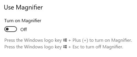
Windows Magnifier can be turned on and off using the button on the settings page. Alternatively, you can use the keyboard shortcut, Win plus + to turn it on and Win plus Esc to turn it off.
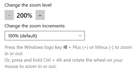
In the settings, you can change the initial zoom and the zoom increments. You can increase and decrease the zoom using Win plus + or -.
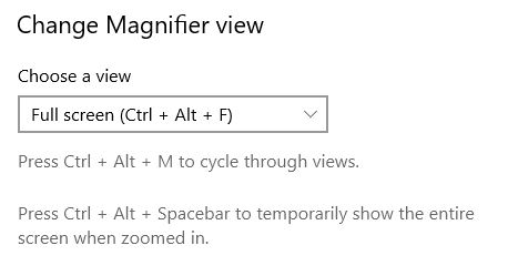
Also in the settings, you can change the view. The options are the same as for Windows 11 magnifier. You can have full screen, docked or lens.
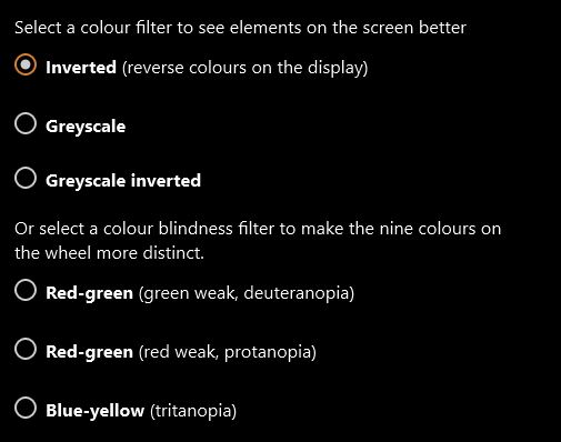
Colour filters
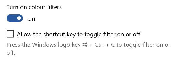
Colour filters can help people with low vision but are particularly useful for people who are colour-blind. You can select from different options, depending on which colours you find difficult to distinguish. First of all, you have to turn the filters on.
Then you can select from different options. The first set of options are generic, and are similar to high contrast. You can choose from:
- Inverted (reverse colours on the display)
- Greyscale
- Greyscale inverted.
The second group of options is for people who are colour-blind. These are:
- Red-green (green weak, deuteranopia)
- Red-green (red weak, protanopia)
- Blue-yellow (tritanopia).
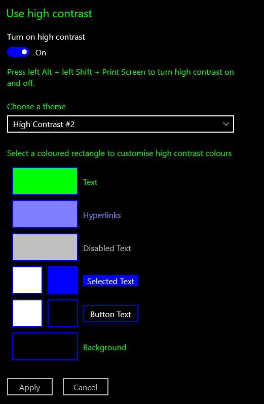
High contrast
High contrast can make content easier to see. As well as changing to different high contrast themes, you can also edit them to make different types of content more visible, e.g. links and buttons.
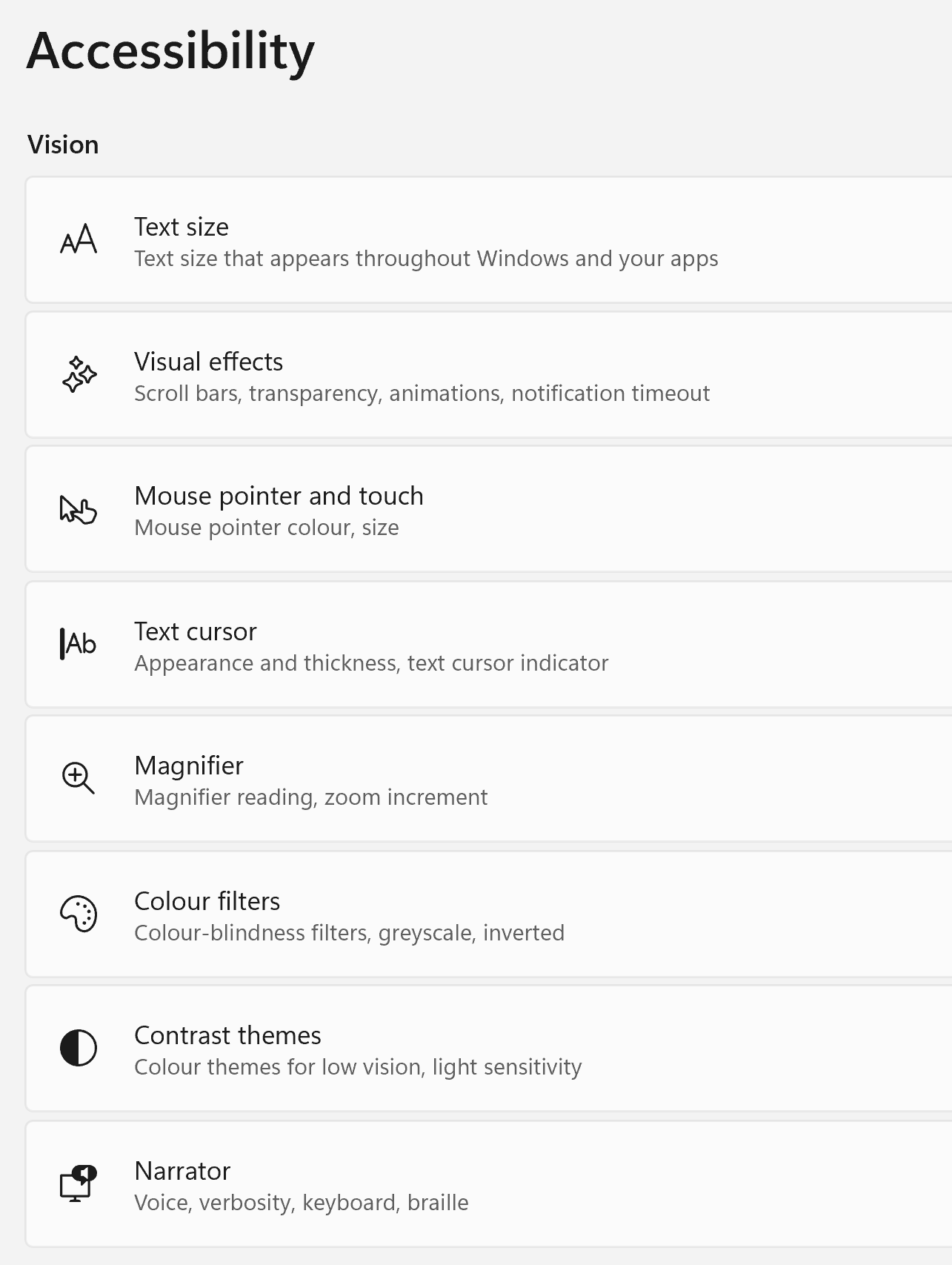
Windows 11 - Accessibility
In Windows 11, you can access Accessibility via the Settings menu. It is no longer called Ease of Access but it does have most of the same features. When you open it, there is a submenu which includes: text size, visual effects, mouse pointer and touch, text cursor, magnifier, colour filter, contrast themes, and narrator. We will look at narrator in the next post.
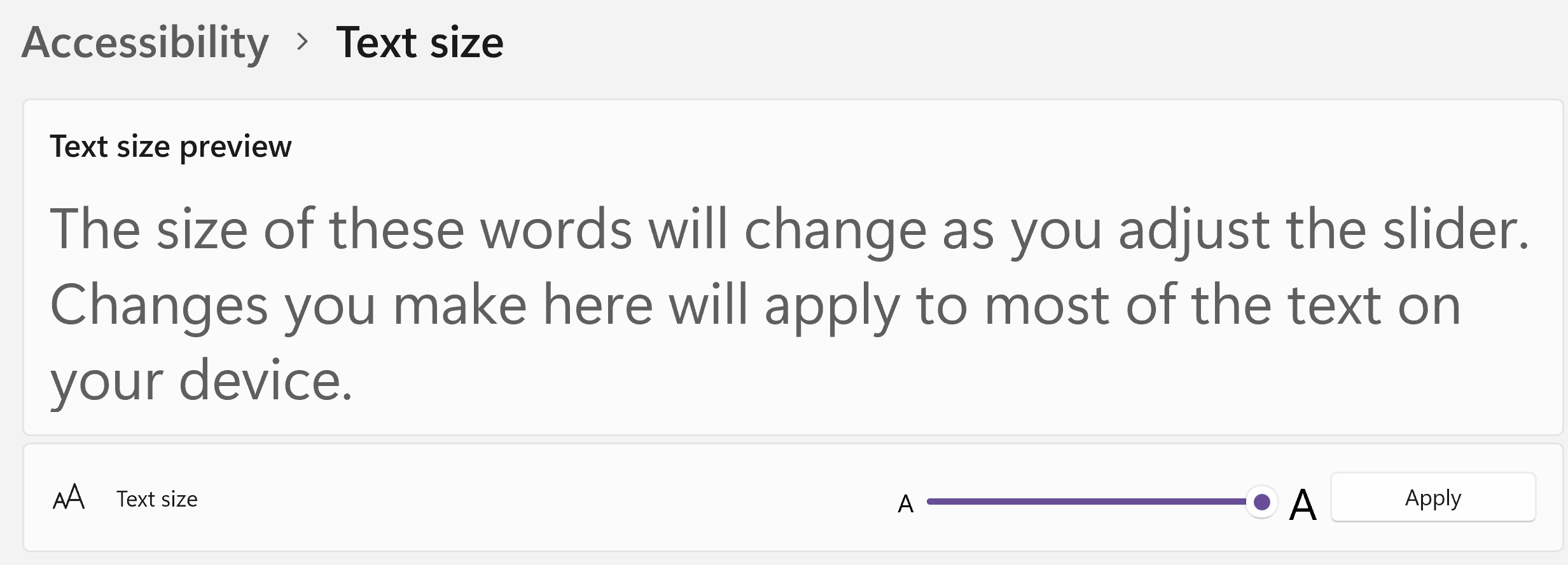
Text size
If you need the size of all text, including icons, to be a little bit bigger, this is where I would start. It is easy to use with a mouse or keyboard. Select Text Size in the menu and then move the bar to the right to make text bigger. There is a sample text window, so you can see the effect. When you are happy with the text size, click Apply. Then most text on the whole device will be at that size.
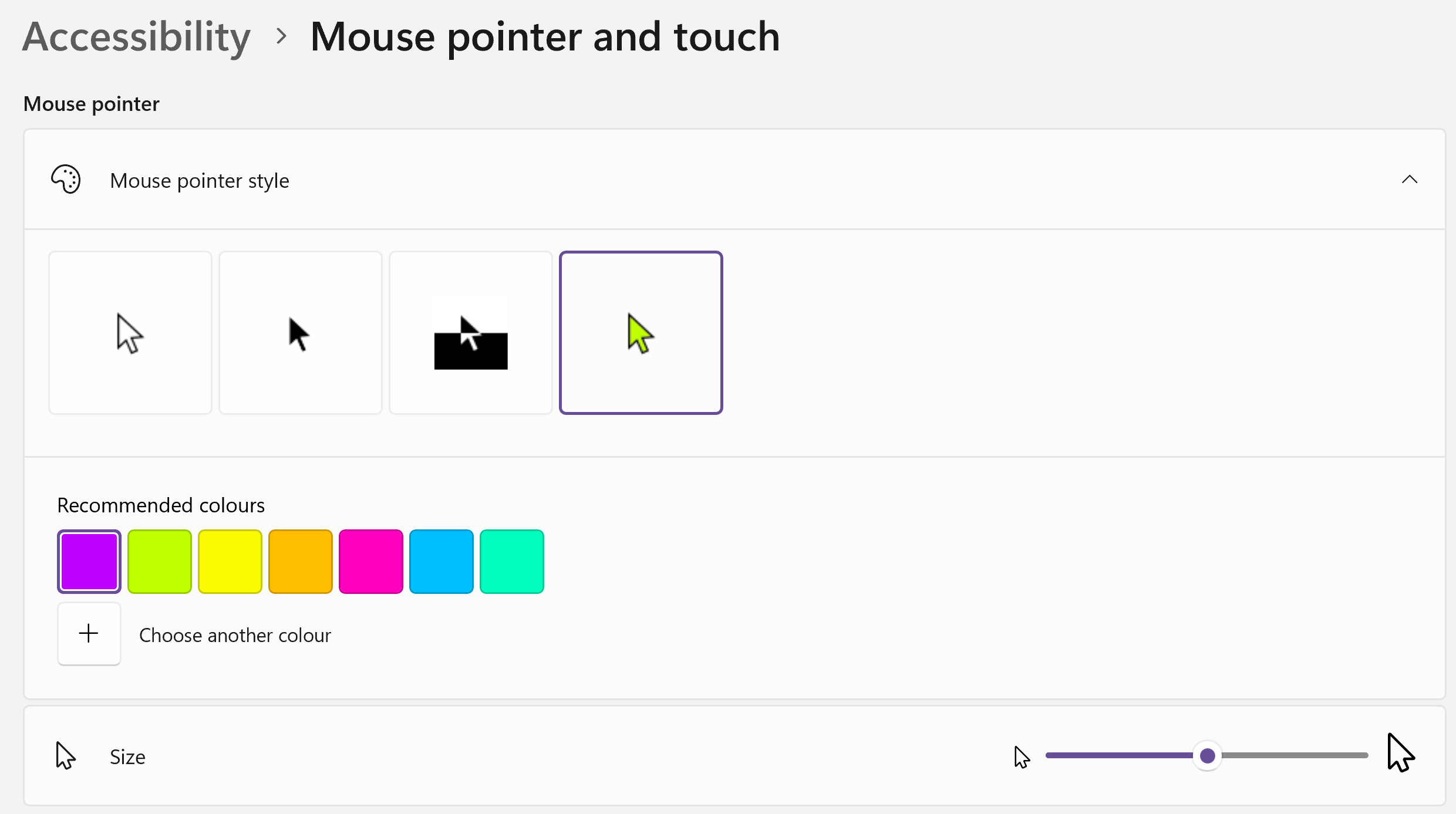
Mouse pointer and touch
As well as being useful for low vision, this is a handy tip for people who demonstrate via virtual platforms, such as Teams or Zoom. It makes the mouse pointer so much easier to see. I don't have low vision, but I do use this feature.
- Choose your preferred type of mouse pointer. You can have white, black, inverted or custom. I like the custom option.
- If you've chosen custom, choose a colour from the recommended colours.
- If you don't like the recommended colours, click on Choose another colour, and either select from the palette or open the More menu to put in RGB or Hex colour codes.
- Change the size of the mouse pointer by sliding the bar to the right.
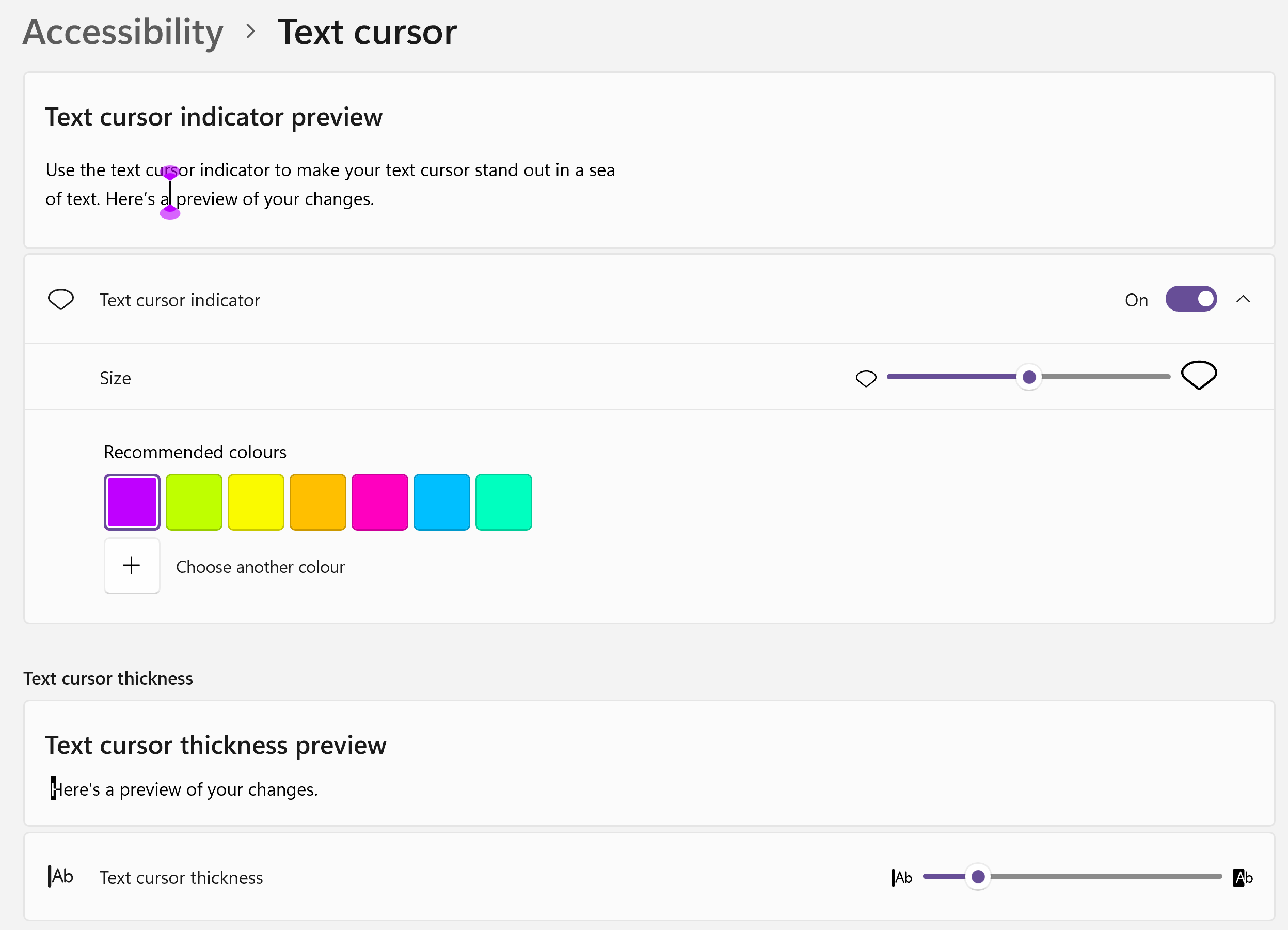
Text cursor
This is very similar to the previous section, but this one changes the text cursor. That is the small vertical line that shows you where you are typing. You can change the thickness of the line to make it easier to see, but the thicker you make it, the more it also covers the letters you type, so it is a balancing game.
I find it more useful to turn on the text cursor indicator. This adds little coloured blobs to the top and bottom of the cursor to make it easier to spot on the page. You can change the size and colour of these blobs.
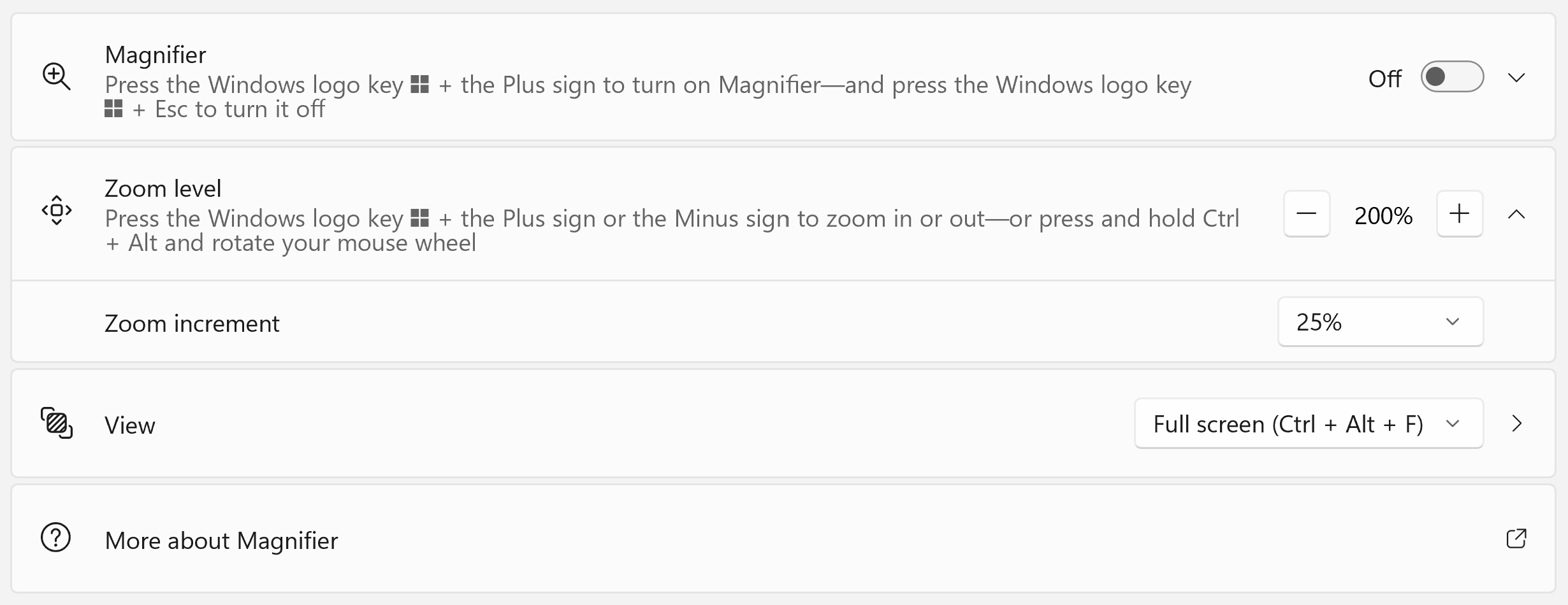
Magnifier
To turn magnifier on, press Win and +. To turn it off, press Win and Esc. In the settings menu, you can change the zoom level that will be activated when you first turn it on and the increment that it will increase or decrease when you zoom in or out. Win and + will zoom in and Win and - will zoom out.
You can also change the view. This is where the magnified content will be displayed. There are three options:
- Full screen - the entire screen is magnified and you have to use your mouse to move around. You have to get used to when you need to scroll down the actual document and when you just need to move down the magnified screen.
- Docked - you keep the main screen and the magnified portion appears in a bar along the top of the screen. This can be easier to move around if you can track where you are on the main screen.
- Lens - a square box appears by the content that the mouse is hovering over. This box contains a magnification of the area around the mouse pointer.
Colour filters
I can't produce a useful screen shot of this one because it is a filter. Colour filters can be fantastic! They don't actually change the content at all but apply a layer on top that makes it look different.
If you switch colour filters on, and then try the different options, the preview window at the top shows you the result. Once you have found one you like, you can then check that it works for you in your documents and other windows. Some of the filters are supposed to correct colour blindness by strenthening the difference between red and green, or blue and yellow.
If you want to be able to toggle the colour filter on and off using a keyboard shortcut, you have to turn this option on first. Then the keyboard shortcut is Ctrl + Win + C.
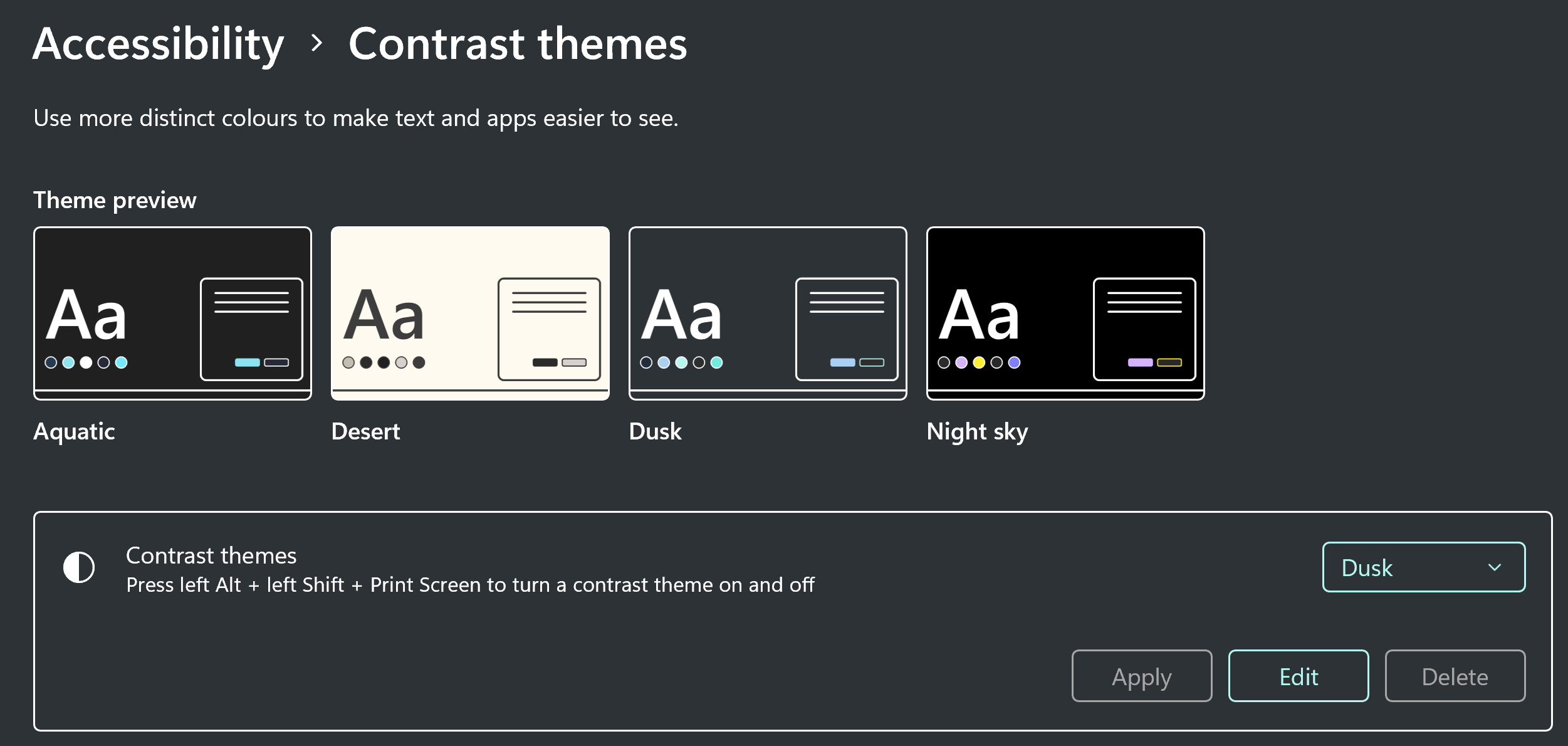
Contrast themes
Colour filters work with absolutely everything because they are a layer on top of the screen. Contrast themes work differently. It changes most things though and I find some of the options quite useful, particularly when I sense a migraine approaching.
There are four options and within each option, you can edit specific features and change the colours to suit your needs. The following example shows the dusk theme, with no editing.
ZoomText
ZoomText is a licenced assistive software, produced by Freedom Scientific. It is often deployed alongwith JAWS (screen reader) as part of a product called Fusion.
Zoom Level
The first and most obvious thing you can do with ZoomText is zoom in. You can zoom to 16 times the normal size, which is so big, you'd probably need a bigger screen for it to be helpful. This example shows Microsoft Word at 12 times magnification.
Colour
There are six colour schemes to choose from in ZoomText but you can also create your own custom colour schemes. The six predefined schemes are:
- Invert brightness
- Invert colours
- Yellow on black
- Blue dye
- Black and white
- White and black.
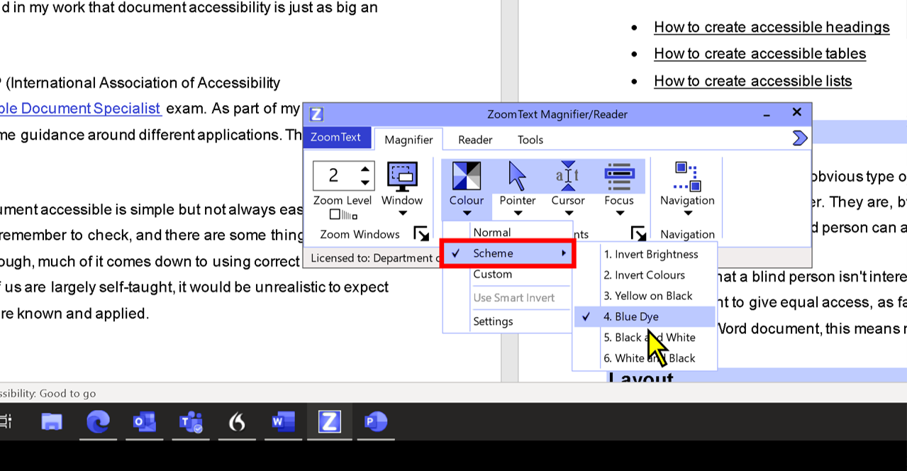
My favourite is blue dye, because I have photosensitivity issues and I find the blue dye minimises the light entering my eyes. To help you compare though, here are two screenshots of the same document. The only change is the colour scheme.
Pointer
There are six pointer schemes to choose from. These all aim to make it easier to see and track where the pointer is on the screen. The six predefined pointer schemes are:
- Yellow with full crosshairs
- Red with circle
- Giant green
- Control key crosshair
- Circle when moving
- Large yellow.
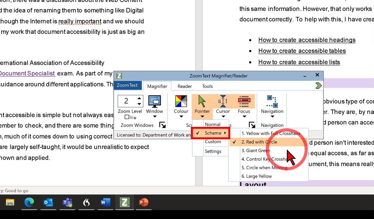
I quite like the red with circle option. It might depend though on what colours your favourite websites use. If the background contains red, it wouldn't be so easy to see. I also like the red pointer hand.
Cursor
The text cursor shows where you are typing. This thin vertical line can be very difficult to see. ZoomText provides four preset options to enhance the cursor to make it more visible:
- Blue wedge
- Green circle
- Red frame
- Thin magenta frame.
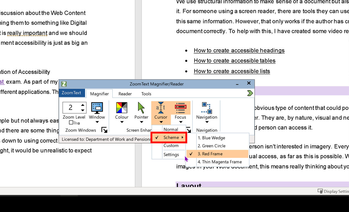
I was tempted to show all the options here but this post is already resembling War and Peace, so I decided to just pick one as an example. The blue wedge is not dissimilar to the indicator on the Windows text cursor. It is a blue triangle at the top and bottom of the cursor. The other three are around the cursor, like the image that follows. This red square has a thick border and is easier to see than the cursor itself.
Focus
I think that the focus indicator in ZoomText is what marks ZoomText as a big step ahead of the free Windows tools. Firstly, you can choose what kind of focus indicator you find easiest to work with. There is a choice of four:
- Red rectangle
- Thick green underline
- Yellow block
- Thin red rectangle.
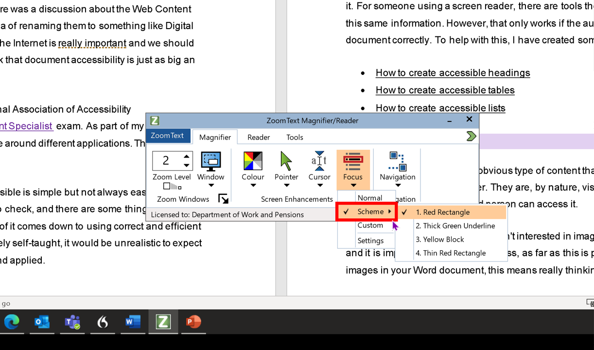
My favourite is the red rectangle, so I've taken a screenshot of that. What I can't show easily in images though is how it behaves. Sure, it is great in documents, but on websites, I love it! If you get an error message, for example when you fill in a form and accidently miss a field, the focus goes with the indicator to ensure that it shows at the top of your screen. I haven't seen any of the other magnifiers do that.
Apple Zoom
I was hoping to include some screen shots in this section too but I'm not the best with Apple and I couldn't get the screenshots to capture the zoom or hover. When I opened the images, they just looked like the normal screen with no zoom at all.
Zoom in and out
If you open Settings and click on Accessibility, there is a menu down the left side of the window. Select Zoom. You can turn on Zoom and then use a combination of keys to toggle the zoom feature on and off.
Apple have produced some very clear Zoom guidance ![]() .
.
Hover text
This is a feature I really like. When you turn it on, also in the Accessibility - Zoom settings, it creates a high-resolution zoomed version of whatever you are hovering over. This appears in a separate window, that you can customise. What I like about it, is that it doesn't compete with the text beneath. It kind of isolates the part you want to see better.
Creating content for users with low vision
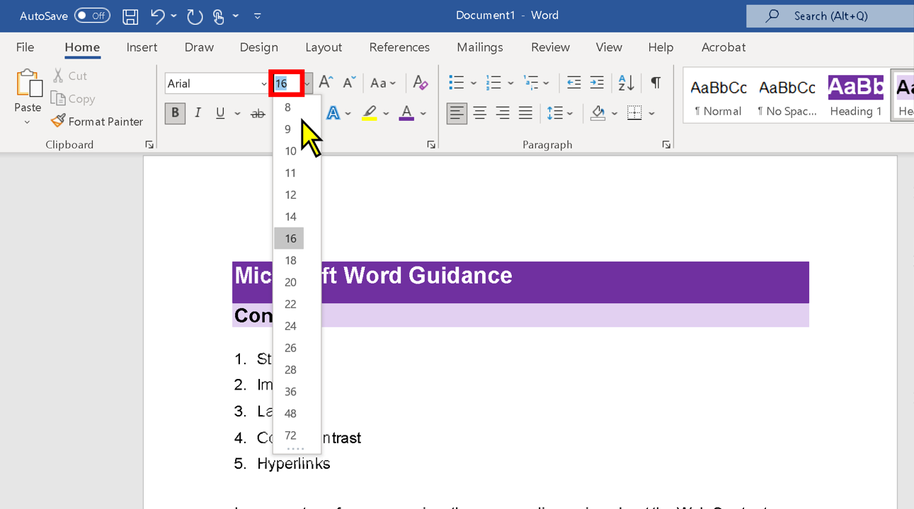
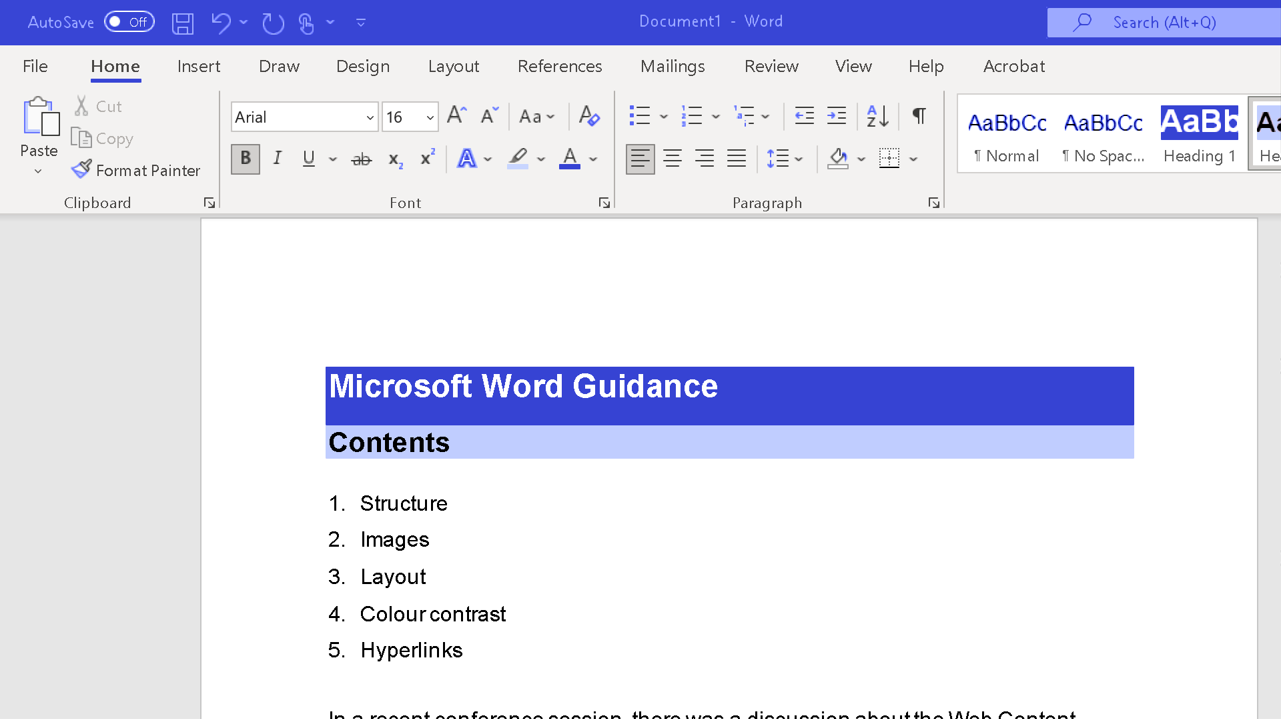
Font settings
There are no absolute rules about fonts but the following make it easier to read:
- Use a sans serif font
- Avoid script fonts and other fancy fonts, especially for normal text
- In a document, make the font size at least 12
- On slides, make the font size at least 20
- Use bold and italic sparingly, and only where emphasis is needed
- Avoid underlining text, as it is usually associated with links, so can be confusing
- Avoid ALL CAPS as it is difficult to read and is now commonly associated with shouting.
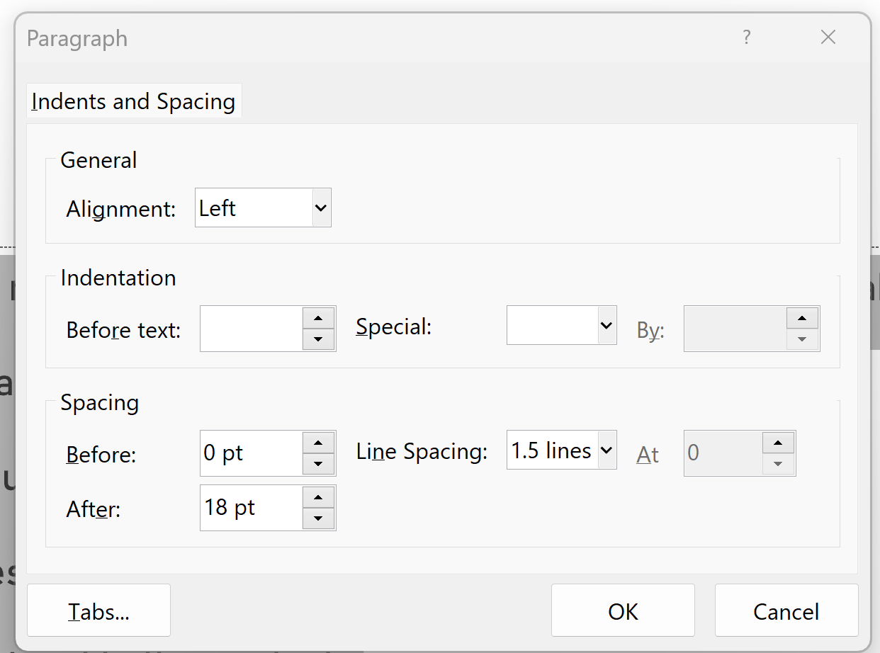
Paragraph settings
For normal text in both documents and slides, you can make it easier to read by adjusting the paragraph settings. You can access these by highlighting text and then right-clicking with the mouse and selecting Paragraph, or by clicking on the Paragraph pop-out on the Home ribbon.
Wherever possible, I would recommend changing the line spacing to 1.5 and adding 18pt of spacing after each paragraph. This might seem like an arbitrary recommendation, but it fits with the advice given in the Web Content Accessibility Guidelines (success criteria 1.4.12 Text Spacing).
One thing that can cause difficulties for people using a magnifier, is white space. The amount of white space may not look much when viewed at 100% but if someone is viewing it at 16 times that, a small amount of white space can be huge. Do not press Enter multiple times to create gaps in a document. These are difficult to navigate. It is better to use paragraph spacing and page breaks where extra space is needed.
Colour contrast
Colour contrast can seem difficult to understand. We explain it using ratios and most people have no idea how those ratios are calculated. The good news is, you don't have to understand them because there are free tools that do it for you and tell you whether it passes or fails. My favourite tool is the WebAIM Contrast Checker ![]() .
.
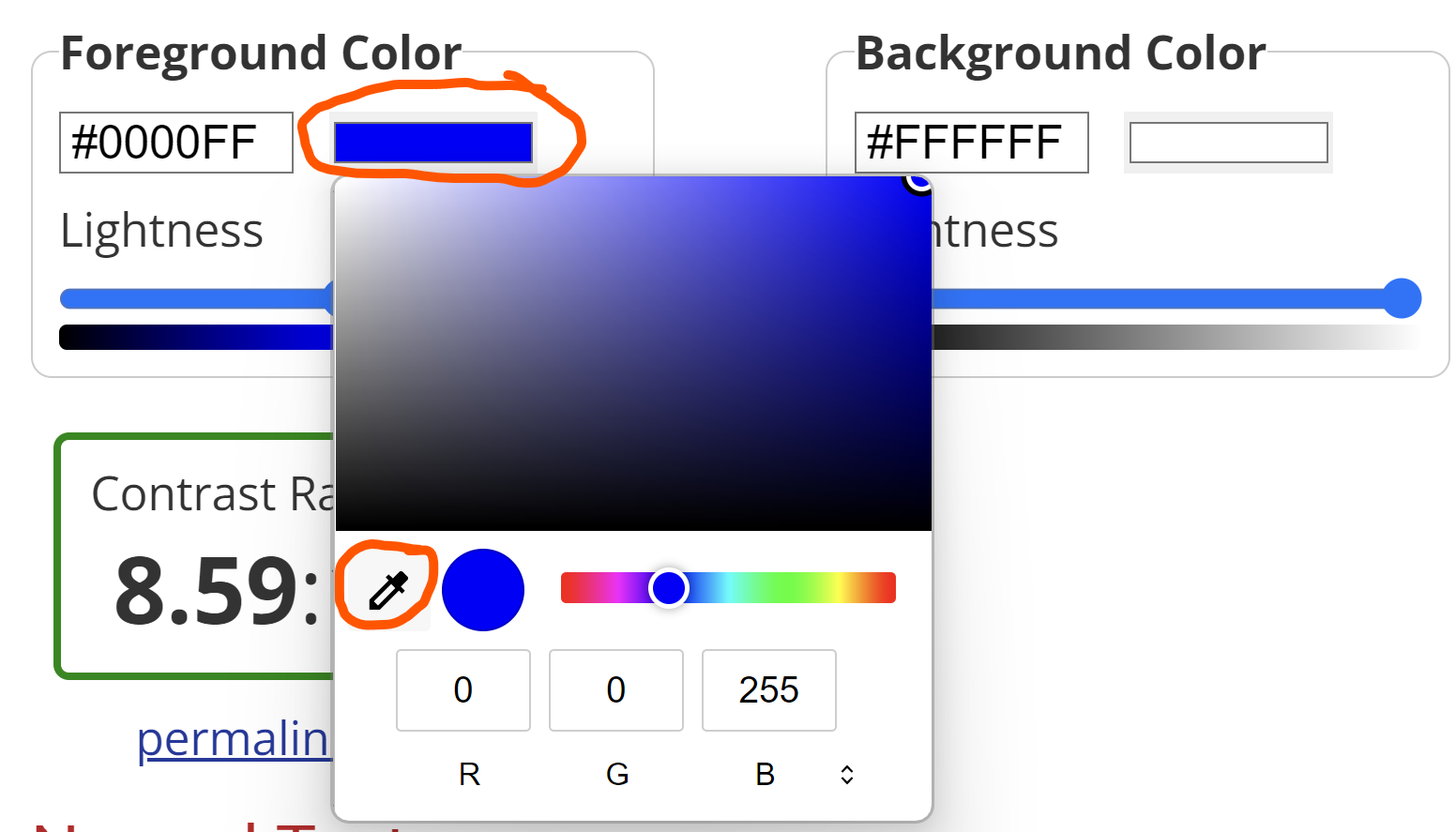
If you know the colour codes you have used, you can just pop them in for the foreground and background colours. If you don't know the codes, it's easier to use the eye dropper tool. Click on the coloured bar for either foreground or background, and then select the eye dropper. Take that to your work and ensure that the colour you are using is right in the middle of the circle. Then select. When you click away from the tool, it will calculate the ratio and give you a pass or fail.
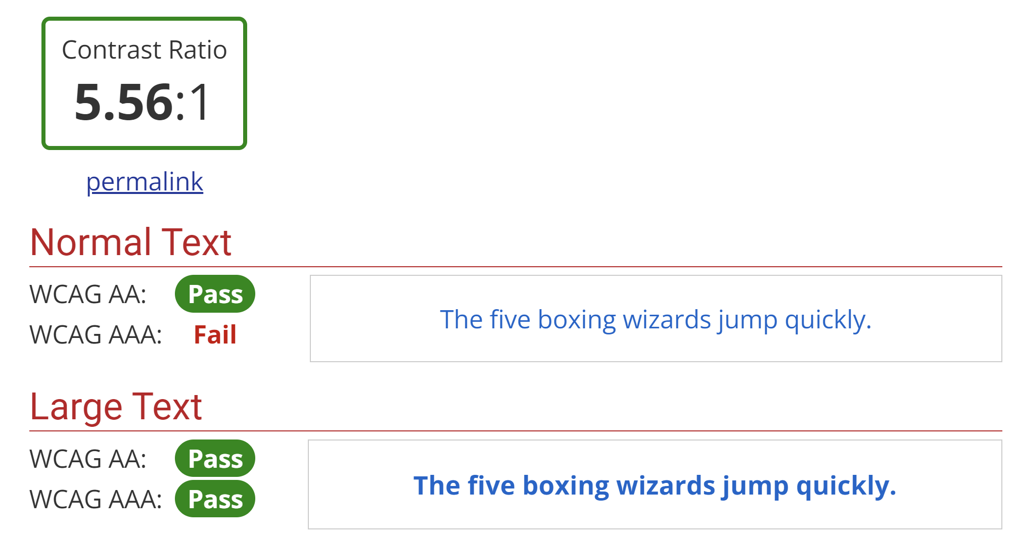
When looking at the pass and fail section, for most things, it is fine to work to AA level. Large text is font size 14 and larger if it's bold and 18 or larger if not. Normal is anything smaller than that.
The results are displayed as follows. This one is a check for the font colour I use on this website. It passes at AA level for normal text, and at AA and AAA level for large text. Incidentally, I chose this colour rather than black because some dyslexic people find black on white more difficult to read.
Images
One of the most frustrating things I find in documents and slides, is when an image is used which goes blurry when you zoom in. We sometimes say it becomes pixelated. Always check this by zooming in to your images. If it goes blurry, you need to find or create an image with higher resolution. When saving images, try not to save space by compressing them or saving in low resolution.
Summary
If you are still reading, thanks! I think this is the longest blog post I've ever written. I seriously considered splitting it into smaller parts but hopefully the content links at the top have allowed you to find the information most relevant to you.
So what are the key messages? The most important thing to know is that low vision doesn't need to stop you using a computer. There are many tools, both free and paid for, to make life easier for you. I would always suggest trying the free tools first and only pay if you have to.
If you create content, please consider people with low vision. Make their life easier wherever you can. Make sure you use clear, easy to read fonts and keep the colour contrast nice and strong. Also, remember to use high resolution images, so that they don't go all blurry when somebody zooms in.