Published: 30 December 2022
I find reading difficult
The first thing I want to say about this, is that it is a sensitive topic. Our culture in the UK is that we expect high levels of literacy as the norm. If you think about other skills, it is okay to be good at some things and not at others. I'm good at maths and IT but I'm not very good at art and team sports. We accept that everyone has strengths and weaknesses because we are all different.
I was a primary school teacher for over 20 years. One of the things that frustrated me, was when news stories said that x% of children leave primary school unable to read and write. In my experience, almost 0% of children leave primary school unable to read and write. Many leave unable to jump through the literacy hoops that the government demands, but most children can read and write to some level.
I think that if we made all adults take a Key Stage 2 reading test (SATs), most would not achieve the score we expect of an 'average' year 6 pupil. That is because we expect children to do more than just read the text and understand it. So when we say that the average reading age in the UK is that of a 9 year old, it sounds terrible but it is not the full picture.
The average 9 year old actually reads quite well. Learning to read is not a linear process. Children don't learn to read the same number of new words each year, throughout school. Progress in the first year or two is much faster than at any other stage. Another problem is that reading age assesses both the ability to read words and the ability to understand them. Adults, even adults that can't read at all, will understand more words than a 9 year old.
So let's not focus too much on reading age. Instead, let's see what we can do to make our content easier to read.
Why might reading be difficult?
There are many reasons why somebody might find reading difficult. We will not go into detail but here are some possibilities:
- Dyslexia or other learning difficulty
- ADHD
- English is not your first language
- Didn't learn at school
- Poor short-term memory
- Low concentration levels.
Some people find it difficult to recognise the words. To read fluently, you must be able to read most words on sight. If you have to stop and decode each word, it is more difficult. When I read in Finnish, I still have to sound out long words. Then, when I have sounded out all the words I couldn't read by sight, I have to read the whole sentence again.
Some people can read the words but they can't process what it means. If the text is too long or complicated, they might give up because it is too difficult. Again, I find this with Finnish texts. If it is written in plain Finnish, I can usually read and understand it. If not, I start reading but then give up.
How can I help?
If you are creating content, there are some simple things you can do to help.
Think about your audience
It is important to pitch your content at the right level. If you are writing your PhD thesis, you will be expected to use academic language. If you are writing something technical or scientific, you cannot avoid using terminology that will make it more difficult to read. However, if it's for general use, then try to keep it as easy as possible to read.
We think that about 10% of the population are dyslexic. The British Dyslexia Association have published a dyslexia-friendly style guide ![]() . Although it is good to follow guidelines, remember that everybody is different. What works for one person might not work for another. I like to give the user as much choice as possible. In most document formats, the user can change fonts and colours if they want to. This is one reason that I avoid PDFs. It takes away user choice and forces the user to read what works for me, not them.
. Although it is good to follow guidelines, remember that everybody is different. What works for one person might not work for another. I like to give the user as much choice as possible. In most document formats, the user can change fonts and colours if they want to. This is one reason that I avoid PDFs. It takes away user choice and forces the user to read what works for me, not them.
Use clear text and layout
If someone is dyslexic or visually impaired, things like font choices, layout and line spacing can make it easier to read.
Fonts
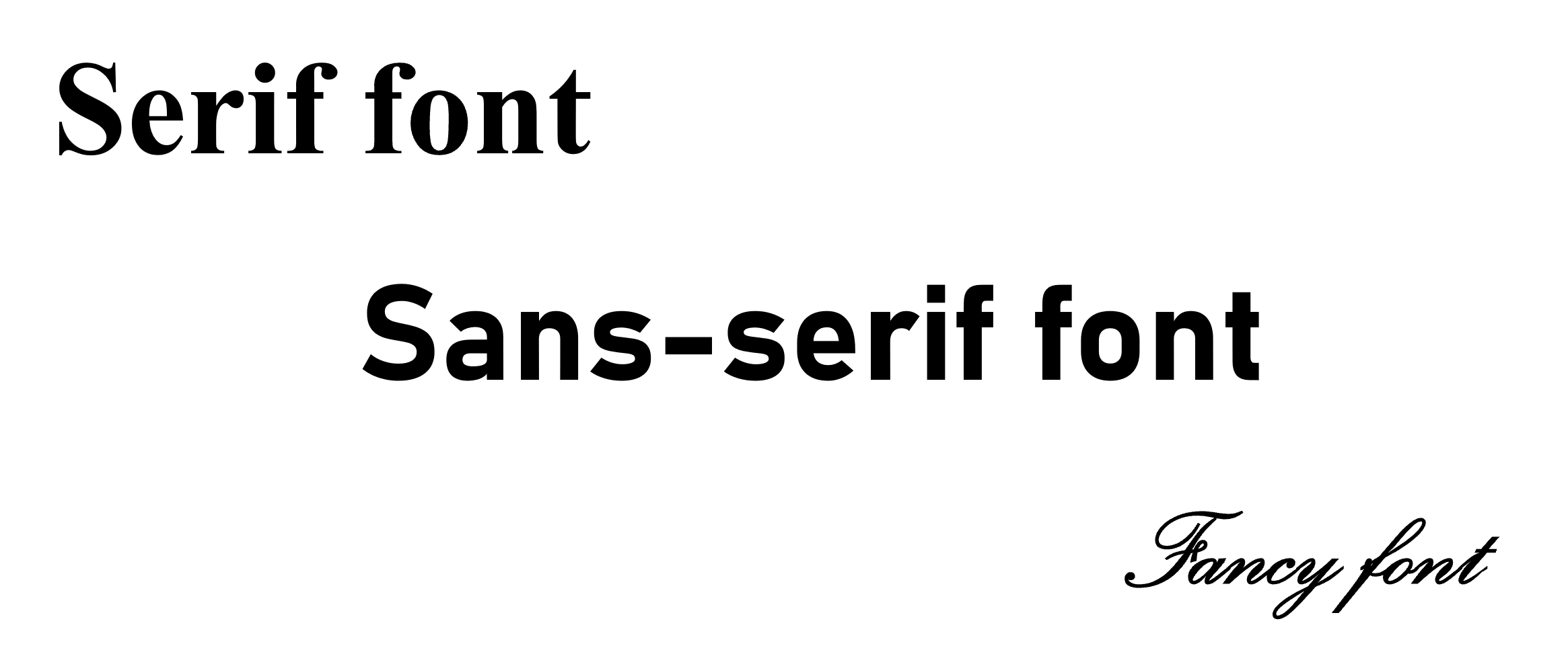
Choose sans-serif fonts that are clear to read. Serif fonts have decorative lines or feet at the bottom of each character. These make the letters less clear and make it more difficult to read.

Some good fonts to use are:
- Arial
- Calibri
- Trebuchet
- Open Sans
- Bahnschrift.
For normal text, choose font size 12 or 14. Headings should be larger. In another post, I'll show you the best way to format headings. It is okay to use bold to make words or phrases stand out, but avoid using italics too much, as it makes it harder to read. Also, don't underline text unless it is a link. One of the ways people identify links is that they are underlined. If you underline other text, it can be confusing.
Alignment
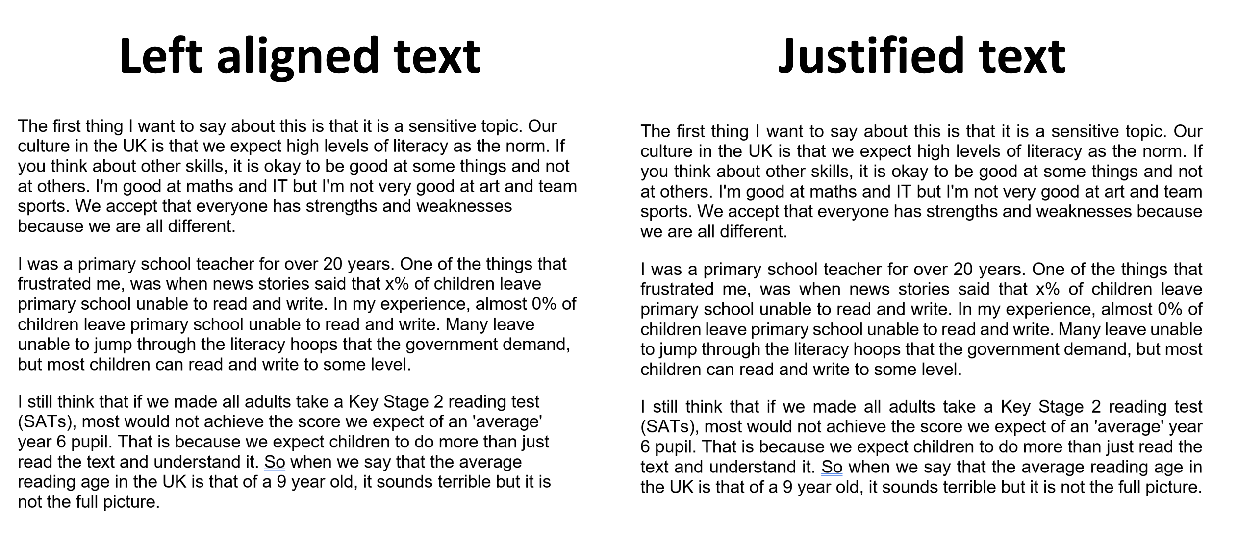
Most text should be left-aligned. Don't justify text. Justified text adds in extra spaces between words to make the left and right margins look straight. These extra spaces can make it difficult to read. It makes it more difficult to move from one line to the next, because all the lines look the same. The following image shows the difference between left-aligned text and justified text.

Line spacing
When creating Word documents, PowerPoint slides or emails, I always set the line spacing to 1.5 and add 18pt of space between paragraphs. This makes it easier to read. You can do this in the paragraph settings. You might want to look at my page on Text Spacing in Word, to learn how to do this.
Write in Plain English
Writing in plain English doesn't mean writing as if a small child will be reading it. This is where there is some debate about terminology and the use of reading ages or grades to measure readability. Just because a person finds it difficult to read, it doesn't mean they have low vocabulary or ability to understand difficult concepts. It is more about keeping the text easy to read and process.
Short sentences and paragraphs
Long sections of text can feel very intimidating. It makes it easier to read if you use shorter sentences and paragraphs. That doesn't mean that every sentence must be short. It is good to have variety - some short sentences and some longer ones. Try not to have very long sentences though. If a sentence is going on forever, try to break it down into two shorter sentences instead.
It's the same with paragraphs. There is space between paragraphs, and that space helps the reader to process where they are on the page. When paragraphs are too long, it becomes difficult to keep track and some readers may lose interest.
Use headings
Headings are a useful tool to help the reader find information. I don't know about you but I rarely read everything in a document. I usually skim through the headings to find the information I want to read.
Headings should be bigger than normal text and might be bold or a different colour. They should be easy to spot without having to actually read the content.
Use active rather than passive voice
I remember when I started secondary school, we had to write chemistry reports in the third person passive. It was really difficult and felt unnatural to write this way. I don't want to start a grammar lesson here but the active voice is more straightforward to read and understand. Here is an example.
Active: James wrote an article about dyslexia.
Passive: An article about dyslexia was written by James.
I find it easy to think of it like this. Active sentences tell you who did what. Passive sentences tell you what was done. This is why science reports were written in the passive voice. It meant that you could avoid any reference to who did it.
If you have no idea what I'm talking about and you're now completely confused, don't worry. One of the tools we will look at for checking, will help you.
Use lists
Where possible, use lists to make text easier to read. If you have a list of things that have to be done in a certain order, use a numbered list. If the order doesn't matter, use a bullet point list. For example, instructions are usually a numbered list, whereas a list of gift ideas would use bullet points.
Use visuals
Think about ways of showing information in a visual way. You could use a picture, a graph, a diagram or some other way of showing information that doesn't rely on words. However, be careful! Remember that blind people may use a screen reader and they won't be able to access this information as easily. It's about providing different ways of taking in the information, so that the reader can focus on what works for them.
How can I check my content?
The best way of checking whether your content is readable is to ask the people who read it. In a professional context, we call it user research or user testing. The aim is to find out whether your users can use what you have created. For most people though, creating documents, it isn't practical to do user research.
Hemingway Editor
I find the Hemingway Editor ![]() useful because it highlights sections of my text that I might want to think about. Although I do look at the readability grade, I am more interested in the section below that points out possible issues.
useful because it highlights sections of my text that I might want to think about. Although I do look at the readability grade, I am more interested in the section below that points out possible issues.
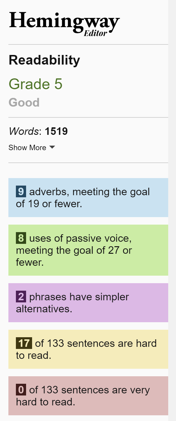
The following screenshot shows the results for this blog post (as far as this paragraph).
 Long description: Readability has been assessed as grade 5, which is good.
There are 1,519 words.
I've used 9 adverbs. The goal is 19 or fewer.
I've used the passive voice 8 times. The goal is 27 or fewer.
I've used 2 phrases which have simpler alternatives.
17 out of 133 sentences are hard to read. None are very hard to read.
I have no idea how they work out the goals but I have noticed that they increase, the more you write. So it's a proportion of your total content. My aim is not to clear all highlighted issues. It just prompts me to take a second look. If I can reword something to make it clearer, I will. If not, I just leave it.
For example, let's look at the following paragraph.

The green highlight shows where I've used passive voice. I thought about rewording it but it doesn't make as much sense (to me, at least).
Passive: If you are writing your PhD thesis, you will be expected to use academic language.
Active: If you are writing your PhD thesis, they will expect you to use academic language.
The yellow highlight shows a sentence that Hemingway has decided is hard to read. I could have reworded it, getting rid of long words and shortening the sentence until the yellow disappeared but that would have changed the meaning.
This is one of the problems of using reading ages. I'm writing for an adult audience. I want to make it clear and easy to read but not childish. If most of my sentences were hard to read, I should probably reconsider, but they are not.
The pink highlighted word, however, has a simpler alternative. If I hover over it, it suggests using either 'but' or 'yet'. I did think about changing the word but then decided I preferred 'however'. You don't have to change everything. Just read it again, consider your options and then decide what you want to say.
Summary
The aim of the game is to make your content easy for most people to read. Don't get hung up on reading ages and grammar. Just make sure you use clear font that is well spaced out and left-aligned. Try to break up long sections of text with headings, visuals and lists. If possible, get someone to give you feedback on how readable it is. Use automated checkers, such as Hemingway Editor, with caution. They can give you useful information but are not the holy grail.
Finally, read your content yourself before posting, sending, publishing, etc. I often use Windows Narrator to read mine back to me. I find it easier to spot mistakes when I'm listening than reading. We'll look at screen readers in a later post.
