Published: 14 August 2022
Forms
On Monday, I am due to sit the Accessible Document Specialist (ADS) exam. Document accessibility has increasingly become something of a passion for me. I mean, web accessibility is also important but documents are something that we all produce. It's not a specialist field. At work, I suspect more of our disabled colleagues receive inaccessible documents than any other kind of content.
I'm pretty confident with most of the exam content but I've been revising the bits that I'm least confident about. Today, I'm focussing on forms. If I was producing a form, I would probably use html and make it a web form. I think that is the most accessible way of doing it. However, I have to know about forms in Word, Excel and PDF for the exam, so today that's what I'm revising. To help me consolidate my thoughts, I'll summarise each section in this blog post.
Word forms
This is the easy part. Forms in Word are not really accessible. The main difficulty is that in a form, you need the questions to be protected so that they can't be deleted and the answer fields to be useable. This is difficult to achieve in Word, in such a way that a screen reader can access it.
I have been sent forms in Word to check for accessibility and they have never been the right solution. In the Civil Service, PDFs are strongly discouraged, so we can't even convert to PDF and fix it, which would be the recommended solution for a form created in Word.
So, basically... Word + Forms = NO.
Excel forms
Forms in Excel can be accessible, if you follow some basic guidelines.
Keep it simple and clear
The first (and hopefully obvious) point is to keep your form clear and simple. It should have a title, a bit of a blurb and some instructions on how to fill it in.
The title should be meaningful and should indicate to the user what the form is about. It should be placed in cell A1. In the same way as a webpage should have a title and a main heading that match, the title of your form should also be the title of the worksheet.
Each form should be on a separate worksheet to help users navigate easily. There should be no blank row between the title and instructions in cell A1, and the beginning of the form.
Two columns is best
To keep your form simple, it should have two columns. In the first column, are the questions or labels. In the section column are the answer fields. It is important for the question or label and the input field to be adjacent to each other with no blank cells in between. The labels should be clear and easy to understand.
Input cells
The input cells should be coloured but not yellow. This helps some users to see where to input the information. Different colours can be used to denote different sections. Remember to check that the colour contrast between the background colour and the text are sufficient.
Why should yellow be avoided for the input cells? Input messages are in yellow boxes, so it would cause confusion.
Data validation
Input messages can be used to help users to fill in the form correctly. These should be kept brief so that the text doesn't fall out of the box.
Data validation can also be used to ensure that the user inputs the correct type or format of data. For example, a field may require a date within a given range. This can be set in the data validation. A custom error message should also be provided to help the user to correct their response.
It should be clear to the user which fields are required and which are optional. This can be explained in cell A1 and can also be set in the data validation settings.
Form controls
Form controls such as radio buttons, check boxes and drop down lists are not accessible in Excel and should be avoided. Try to provide a different way of inputting the information.
It is possible to make an accessible reset button. It takes a bit of VB code and you have to know how to make macros and turn on the developer menu in Excel... but it is pretty good. I might make a video on how to do it.
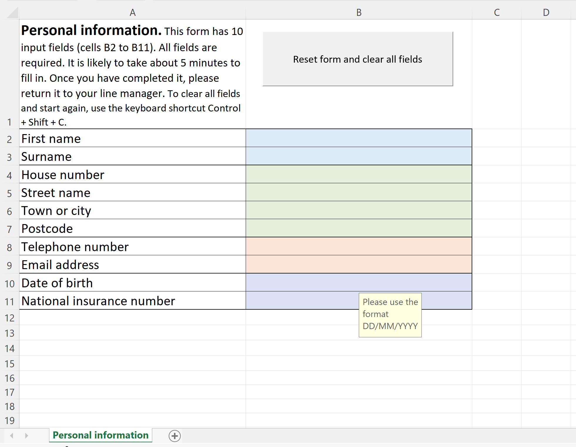
So here is a screenshot of my Excel form, showing cell A1 being used for a title, description and instructions; a personal information form with labels in column A and form fields in column B; a clear form button; a data validation input message in a yellow box; and a clear worksheet name which matches the title. Because I've described it here, I won't go overboard with the alt text.

Before moving on to the final section, I did test this with JAWS and it read really well. The only thing was, some of the data input information didn't read quite as clearly as I would have liked, but it was probably better than no info at all.
PDF forms
Usually, it is better to do all the accessibility work in the source document, before converting to PDF, but forms are different. It is easier to create the form and then remediate it in Adobe Acrobat Pro. I have to admit, I was sceptical about this until I tried it, but I was extremely impressed with the results.
Source form in Word
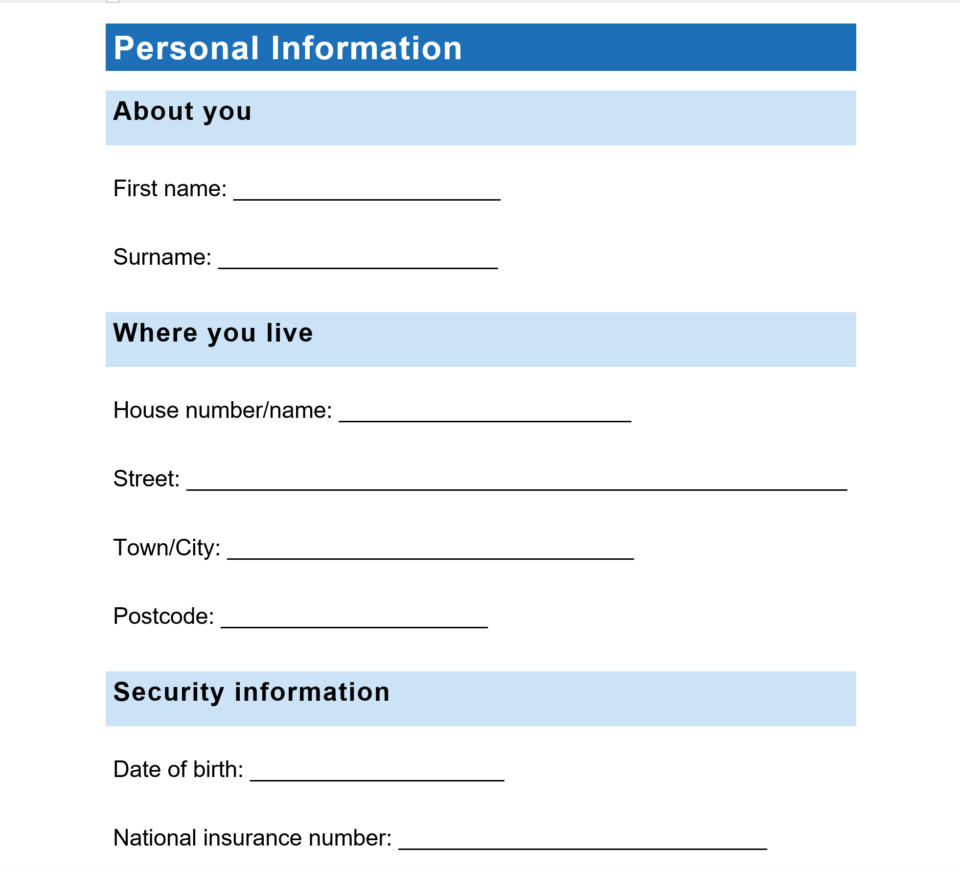
The first step is to create the form in Word, ensuring that the layout is exactly as you want it. I tried this with the same set of Personal Information questions.

Convert to untagged PDF
Yes, this is correct, though this is where I started getting a little nervous. It goes against everything I've been taught thus far. However, I converted, unchecking the accessible PDF option, as I did it.
Prepare form
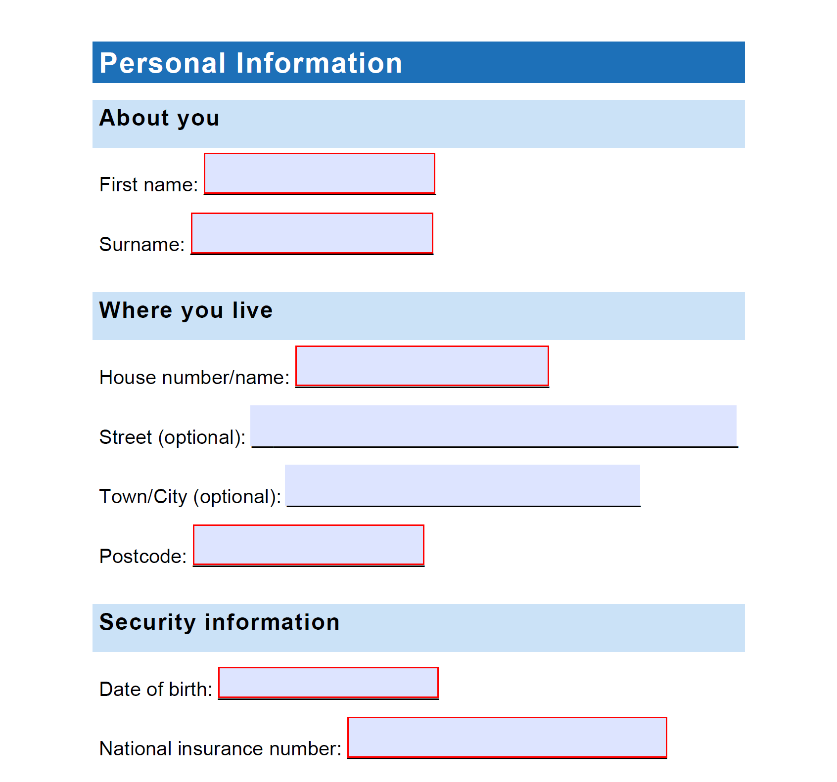
More like, Prepare to be impressed! In the PDF tools, there is an option to Prepare Form. This magically turns your form into something like looks much more form-like. Once the form fields have been created, you can go into their properties to set validation options and input tips and other information.

Tag the document
Okay, so I did find this bit slightly trickier than normal. The easiest way is to autotag the document and then touch them up. It did a reasonable job but it got some of the form fields the wrong way round and I had to add in a couple of extra Form tags. At some point, I will make a video of this one, as I am sure somebody will find it useful.
So, am I ready for this ADS exam? Not sure, but I've done my best to learn all the stuff I need for it. I know I need to be careful about reading the questions carefully and slow down and not rush. So I'm probably as ready as I can be.
Wish me luck!
